¿Qué es el Análisis de Cohortes y Cómo Impulsa el Crecimiento de tu Tienda Shopify?
¿Qué es el análisis de cohortes? Aprende a dejar de depender de informes engañosos y comienza a usar datos de cohortes para aumentar la retención y el LTV de tu marca Shopify.
En esencia, el análisis de cohortes es una forma elegante de decir que estás agrupando clientes basándote en algo que tienen en común—generalmente cuándo compraron por primera vez contigo. Luego, observas cómo se comporta ese grupo a lo largo del tiempo. Es cómo descubres si los clientes que adquiriste en febrero se quedan más tiempo y gastan más que los que trajiste en enero.
Es la medida más verdadera de la salud de tu tienda y la lealtad del cliente.
Por Qué Tus Informes de Ventas de Shopify Te Están Engañando
Si estás manejando una tienda Shopify, probablemente estés nadando en datos. Revisas tu dashboard de Shopify para ingresos, Google Analytics para tráfico, y tu administrador de anuncios de Meta para ROAS. Los números principales pueden estar subiendo, pero tienes esa sensación persistente de que te estás perdiendo algo importante.
¿Realmente estás mejorando en retener clientes, o tu crecimiento solo está tapando las grietas de un cubo con fugas?

Este es un punto ciego clásico para las marcas DTC. Los informes estándar se basan en promedios—valor promedio del pedido, tasa de conversión promedio, ya sabes. Y los promedios mienten. Mezclan el comportamiento de tus fans incondicionales con los compradores de una sola vez, creando una imagen borrosa y poco confiable de tu negocio.
Ver tu negocio a través de promedios es como tratar de diagnosticar un problema de motor solo escuchando su ruido general. No puedes saber qué parte específica está fallando.
Esta vista desordenada y fragmentada hace imposible responder tus preguntas más críticas con verdadera confianza:
- ¿Mi lealtad de clientes realmente está mejorando, o está empeorando?
- ¿Esa campaña costosa de influencer trajo clientes de alto valor o solo un montón de cazadores de descuentos?
- ¿Mis últimas actualizaciones de producto realmente están haciendo que los clientes se queden más tiempo?
Aquí es donde entender qué es el análisis de cohortes se convierte en tu arma secreta. Corta a través del ruido de los promedios engañosos aislando grupos específicos de clientes y rastreando su viaje. En lugar de escuchar el alboroto general del motor, puedes escuchar cada parte individualmente.
Así es como descubres qué está funcionando realmente y qué no. Es el primer paso hacia medir el crecimiento sostenible. Al crear un dashboard de análisis de Shopify unificado, finalmente puedes comenzar a ver estos patrones claramente.
Entendiendo el Análisis de Cohortes en Términos Simples
Entonces, ¿qué es exactamente el análisis de cohortes? Vamos a cortar la jerga.
En su núcleo, una cohorte es simplemente un grupo de clientes que comparten una característica común. Para una tienda Shopify, la característica más útil es generalmente cuándo hicieron su primera compra. Piensa en todos los que compraron por primera vez en enero como una cohorte, los primerizos de febrero como otra, y así sucesivamente.
Imagina a los nuevos clientes de cada mes como una clase que se gradúa. En lugar de mezclar todas las calificaciones de tus estudiantes en un promedio gigante y confuso, sigues cada clase por separado a lo largo de los años. Este simple cambio te permite ver si tus "clases" más nuevas están funcionando mejor que las más antiguas.
¿Los clientes que adquiriste de esa nueva campaña de TikTok se están quedando más tiempo? ¿Tu última línea de productos realmente está mejorando la lealtad del cliente? El análisis de cohortes responde estas preguntas definitivamente al permitirte comparar manzanas con manzanas. Convierte esas corazonadas borrosas sobre la salud de tu tienda en evidencia sólida.
Cohortes de Adquisición vs. Comportamiento
Para realmente obtener el panorama completo, ayuda mirar dos tipos diferentes de cohortes:
- Cohortes de Adquisición: Esta es de la que acabamos de hablar—agrupando clientes por cuándo compraron por primera vez contigo. Por ejemplo, la cohorte "Compradores Primerizos de Enero 2024". Esta es tu opción principal para medir el valor a largo plazo y la adhesión de los clientes que trajiste durante un tiempo específico.
- Cohortes Comportamentales: Esto se vuelve más interesante. Aquí, agrupas clientes por una acción que tomaron. Tal vez sea todos los que usaron un código de descuento específico, compraron un producto particular primero, o se suscribieron a tu newsletter antes de comprar.
Analizar ambos te permite responder preguntas increíblemente específicas. Por ejemplo, ¿los clientes cuya primera compra es un paquete de cuidado de la piel tienen un valor de vida mayor que aquellos que comienzan con un solo labial? Simplemente no puedes obtener ese nivel de detalle de los informes estándar de Shopify.
Cuando el análisis de cohortes se volvió importante para las marcas DTC a principios de los 2010s, reveló algunas verdades bastante duras. ¿Una común? Típicamente, solo alrededor del 20-30% de los clientes de cualquier cohorte de un mes dado regresan para una segunda compra dentro del primer año. Fue un despertar para muchos fundadores.
Con el análisis de cohortes, no solo estás rastreando ingresos; estás rastreando relaciones. Puedes ver precisamente cuándo y por qué esas relaciones se fortalecen o se desvanecen, dándote el poder de realmente mejorarlas.
En última instancia, estas ideas son la clave para mejorar tus métricas de retención de usuarios, que son la base absoluta del crecimiento rentable. Cambiar tu vista de una gran pila desordenada de datos a estos grupos organizados y ordenados es cómo desbloqueas una comprensión mucho más profunda y accionable de tu negocio.
Usando Cohortes para Medir lo que Realmente Importa
Bien, entonces entiendes el concepto de cohortes. Ese es el paso uno. La verdadera magia sucede cuando comienzas a conectar este análisis con los números que realmente mueven la aguja para tu tienda Shopify: ROAS, CAC, LTV, y rentabilidad. Los promedios te dicen qué está pasando, pero las cohortes te dicen por qué está pasando y a quién.
Piénsalo así: mirar la salud general de tu tienda es como un chequeo estándar. El análisis de cohortes es la resonancia magnética. Te da una vista increíblemente detallada y transversal de grupos específicos de clientes, para que puedas ver exactamente qué está pasando bajo la superficie. Así es como dejas de adivinar y comienzas a saber.
De Promedios Borrosos a Ideas Claras
Para los fundadores de Shopify, solo un puñado de métricas realmente determinan si estás construyendo algo que durará. Mirarlas a través de una lente de cohorte te da una lectura mucho más verdadera del impulso de tu negocio.
Valor de Vida del Cliente (LTV): Tu LTV general podría estar subiendo, lo cual se siente genial. Pero ¿qué pasa si una vista de cohorte muestra que tu cohorte de febrero tiene un LTV 30% menor después de tres meses que tu cohorte de enero? Esa es una bandera roja enorme. Te dice que un cambio reciente de marketing está atrayendo clientes menos valiosos, incluso si los ingresos totales están subiendo.
Tasa de Retención de Clientes: Una tasa de retención combinada podría decir que el 40% de todos los clientes hacen una segunda compra. No está mal. Pero el análisis de cohortes podría revelar que tu grupo de temporada navideña tiene una tasa de retención estelar del 60%, mientras que una cohorte que adquiriste a través de una campaña específica de influencer está perdiendo clientes a un doloroso 90%.
Tasa de Compra Repetida: Esta rastrea qué tan seguido los clientes regresan por más. Al aislar cohortes, podrías descubrir que los clientes que compraron una nueva línea de productos están regresando más rápido y más frecuentemente que aquellos que se quedaron con tus antiguos bestsellers.
El análisis de cohortes te obliga a confrontar la verdad sobre tus relaciones con los clientes. Te muestra precisamente qué canales de marketing, productos y experiencias están creando fans leales versus compradores de una sola vez.
Este es el tipo de detalle que necesitas para tomar decisiones inteligentes y confiadas sobre dónde poner tu tiempo y dinero.
Para las marcas serias sobre mejorar estos KPIs, traer servicios profesionales de Optimización de Tasa de Conversión puede ser un cambio radical, y el análisis de cohortes es crucial para medir el impacto real a largo plazo de esos cambios. Te permite duplicar lo que funciona y arreglar lo que no funciona con precisión quirúrgica, en lugar de hacer apuestas amplias y desinformadas que podrían fácilmente resultar contraproducentes.
Cómo Poner el Análisis de Cohortes en Acción
Bien, la teoría es genial, pero vamos a ensuciarnos las manos. La verdadera magia del análisis de cohortes sucede cuando comienzas a leer la historia que tus datos están tratando de contarte. Para un fundador de Shopify, esa historia está escrita en las filas y columnas de una tabla de retención de cohortes.
A primera vista, podría parecer solo otra hoja de cálculo. Pero una vez que sabes cómo leerla, cada celda revela una narrativa poderosa sobre tu marketing, productos, y salud general del negocio. Esto no son solo datos; es un guión para tomar decisiones más inteligentes y rentables.
Esta visualización desglosa las métricas clave que rastrearás con el análisis de cohortes para evaluar el rendimiento de tu marca a lo largo del tiempo.
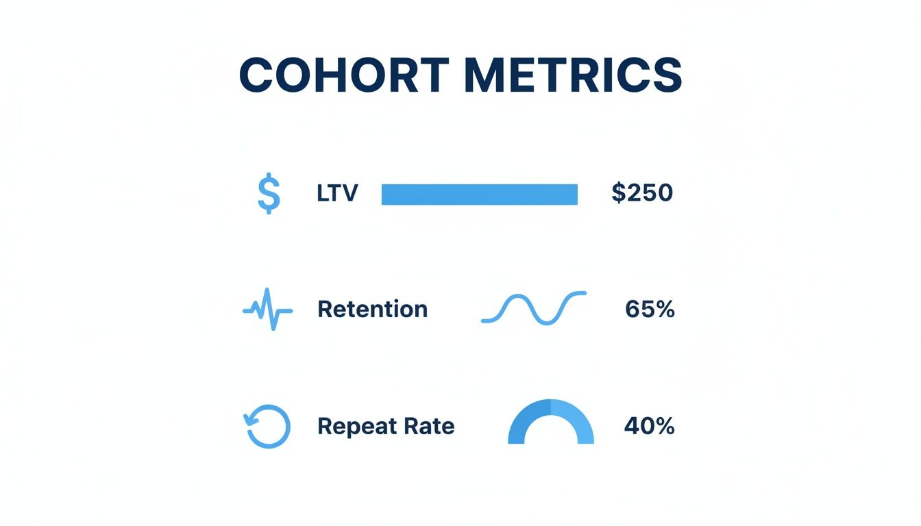
Rastrear estas métricas por cohorte te ayuda a ver si tu LTV está creciendo, tu retención está mejorando, y si las compras repetidas se están volviendo más frecuentes. Es la diferencia entre adivinar y saber.
Leyendo un Gráfico de Cohorte de Adquisición
Vamos a repasar un escenario común. Imagina que hiciste una gran campaña de influencer en febrero después de ver resultados regulares de tus anuncios habituales de Meta en enero. Un gráfico de retención de cohortes es cómo resuelves el debate sobre cuál realmente funcionó mejor.
Compararías la cohorte de "enero" (adquirida vía Meta) contra la cohorte de "febrero" (de la campaña de influencer).
Así es como podría verse una tabla de retención típica mientras comparas estos grupos.
Tabla de Muestra de Retención de Cohorte de Adquisición Mensual
| Mes de Adquisición | Mes 0 | Mes 1 | Mes 2 | Mes 3 |
|---|---|---|---|---|
| Enero 2024 | 100% | 15% | 12% | 10% |
| Febrero 2024 | 100% | 25% | 8% | 5% |
Esta tabla muestra el porcentaje de clientes de cada mes inicial que regresaron a comprar de nuevo en los meses siguientes. De inmediato, emerge una historia.
Mira la retención del Mes 1: La cohorte de febrero destaca con una tasa de retención del 25% en su primer mes, mientras que la cohorte de enero solo tuvo 15%. Esa es una victoria temprana para la campaña de influencer—trajo clientes que fueron más rápidos en comprar de nuevo.
Sigue la tendencia a lo largo del tiempo: Pero aquí está el giro. Para el Mes 3, notas que la retención de la cohorte de enero se ha estabilizado en un sólido 10%, mientras que la cohorte de febrero se ha desplomado a solo 5%. La campaña de influencer entregó un subidón rápido de azúcar, pero los anuncios de Meta trajeron clientes con más poder de permanencia.
Esta simple comparación te da una respuesta clara basada en evidencia. Ya no es una corazonada; sabes qué canal impulsa mejor valor a largo plazo. Para una inmersión más profunda en este proceso, revisa nuestra guía sobre convertir datos en ideas accionables.
Descubriendo Ideas con Cohortes Comportamentales
Ahora, vamos a ser aún más específicos con una cohorte comportamental. Digamos que quieres saber si ciertos productos crean fans más leales. Podrías crear dos cohortes basadas en lo que alguien compró primero:
- Cohorte "Colección de Primavera": Clientes cuya primera compra fue de tu nueva línea de ropa de primavera.
- Cohorte "Artículos para el Hogar": Clientes cuya primera compra fue un artículo de decoración para el hogar.
Después de unos meses, podrías encontrar que la cohorte "Colección de Primavera" tiene una tasa de retención del 28% después de 90 días, mientras que la cohorte "Artículos para el Hogar" está en solo 19%. Esta idea es oro. Te dice que tu línea de ropa no solo está vendiendo; está creando clientes repetidos que se quedan.
Este tipo de análisis cuantifica las disparidades de LTV, lo cual es un cambio radical para las marcas DTC de Shopify. Datos de más de 5,000 tiendas muestran que las cohortes de diferentes canales de adquisición y categorías de productos de primera compra tienen resultados vastamente diferentes, guiando directamente decisiones más inteligentes de inventario y marketing.
Esta es la esencia de la narración de datos. Te estás moviendo más allá de los números superficiales y descubriendo las narrativas que impulsan tu negocio hacia adelante.
Errores Comunes del Análisis de Cohortes a Evitar
Hacer análisis de cohortes de la manera incorrecta puede ser peor que no hacerlo en absoluto. Cuando los datos son engañosos, terminas con malas decisiones, gasto publicitario desperdiciado, y oportunidades que se escurren entre tus dedos. Incluso los marketers más agudos de Shopify pueden caer en algunas trampas comunes que sesgan completamente sus conclusiones.

Piensa en esto como tu guía para evitar las trampas que convierten ideas poderosas en ruido confuso. Al evitar estos errores, te asegurarás de que tu análisis sea preciso, perspicaz, y una base sólida para tu estrategia de crecimiento.
Comparar Cohortes de Tamaños Muy Diferentes
Este es probablemente el error más frecuente que veo. Alguien compara una cohorte masiva de Black Friday con una cohorte diminuta de febrero sin normalizar los datos. Los números brutos siempre harán que el grupo más grande se vea mejor, incluso si su lealtad subyacente es realmente mucho más débil.
No hagas esto: Mirar el número total de compradores repetidos de cada cohorte y asumir que el número más grande significa mejor rendimiento.
Haz esto en su lugar: Enfócate en el porcentaje de retención. Una cohorte pequeña que mantiene al 30% de sus clientes es mucho más saludable que una masiva que solo retiene al 10%.
Así es como comparas manzanas con manzanas. Revela la verdadera adhesión de cada grupo de clientes, sin importar qué tan grande o pequeño fue para empezar.
Ignorar el Impacto de la Estacionalidad
Otro error clásico es olvidarse de revisar el calendario. Una cohorte que adquiriste en diciembre durante la locura de compras navideñas de regalos naturalmente actuará diferente que una de un mes lento de verano. Es solo sentido común.
Lo mismo pasa con tus canales de adquisición. Su rendimiento no es estático. Los datos de más de 10,000 tiendas Shopify revelan una caída pronunciada en la retención, pero varía mucho por canal. Por ejemplo, las cohortes de anuncios de Meta podrían mostrar 22% de retención en el primer mes pero desplomarse a solo 5% para el mes seis. Mientras tanto, las cohortes de búsqueda orgánica tienden a mantenerse mucho más fuertes. Para ver más datos como este, puedes revisar este análisis detallado sobre retención DTC.
Enfocarse Solo en la Retención
Mira, la retención es una pieza masiva del rompecabezas, pero no cuenta toda la historia. Una cohorte de alta retención no es una victoria si tuviste que gastar una fortuna solo para traerlos por la puerta.
- La Trampa: Celebrar con champagne por una cohorte con una tasa de retención del 40%, todo mientras ignoras que su Costo de Adquisición de Cliente (CAC) fue el doble de tu promedio.
- La Solución: Siempre empareja la retención con métricas de rentabilidad como tu ratio LTV a CAC. Una cohorte verdaderamente genial es una que es tanto leal como rentable.
El Futuro: Análisis de Cohortes Impulsado por IA
Saber que deberías estar ejecutando análisis de cohortes es una cosa. Realmente encontrar el tiempo para hacerlo es otra bestia completamente.
Para la mayoría de los fundadores de Shopify, la realidad es un ciclo aplastante de exportar CSVs, limpiar datos desordenados, y luchar con tablas dinámicas en una hoja de cálculo que amenaza con colapsar en cualquier momento. Es un cuello de botella masivo que te mantiene alejado de las mismas ideas que necesitas para crecer.
Aquí es donde el juego está cambiando. El futuro del análisis de cohortes no se trata de mejorar en Excel; se trata de hacer las hojas de cálculo obsoletas para este tipo de trabajo.
De Procesamiento Manual a IA Conversacional
Las plataformas de análisis modernas como MetricMosaic están construidas para automatizar todo este dolor de cabeza. Reúnen todos tus datos en tiempo real—de tu tienda Shopify, Klaviyo, anuncios de Meta, y otros canales—matando el procesamiento manual de datos que se come horas de tu semana.
En lugar de construir fórmulas, solo haces preguntas. En inglés simple. Imagina escribir:
- "¿Cuál es el LTV de 90 días de los clientes de nuestra última campaña de TikTok?"
- "Muéstrame la tasa de compra repetida para la cohorte que primero compró algo de la 'Colección de Primavera'."
- "Compara la rentabilidad de los clientes que obtuvimos de Google vs. Meta el último trimestre."
Ese es el poder del análisis conversacional. Tus datos se convierten en un copiloto con el que puedes hablar, dándote respuestas instantáneas y precisas que te ayudan a dirigir el barco. De cierta manera, es muy parecido a cómo otros campos están siendo transformados por IA en contabilidad, donde la automatización maneja las tareas tediosas para acelerar los informes y liberar a los humanos para pensar estratégicamente.
Ideas Proactivas, Entregadas a Ti
Pero no se detiene ahí. Las mejores plataformas no solo esperan a que hagas preguntas—proactivamente te traen ideas a ti. Usando IA, analizan tus datos de cohortes 24/7, detectan tendencias significativas, y las sirven como historias simples y accionables.
Podrías recibir una alerta que diga: "Advertencia: Tu cohorte de abril está perdiendo clientes 15% más rápido que tu cohorte de marzo. Esto coincide con tu nueva política de envíos. Probablemente deberías revisar los comentarios de los clientes."
Esto voltea todo el proceso de cabeza. El análisis cambia de una tarea reactiva (mirando hacia atrás a lo que pasó) a una ventaja proactiva y con visión de futuro. Estos sistemas incluso pueden comenzar a hacer predicciones inteligentes sobre lo que tus clientes harán después. Si tienes curiosidad sobre eso, nuestra guía sobre análisis predictivo para eCommerce profundiza en cómo puedes anticipar tendencias futuras.
En última instancia, el análisis de cohortes impulsado por IA se trata de obtener respuestas más rápidas e inteligentes sin ahogarte en datos. Convierte la complejidad en claridad y te da una ventaja competitiva real.
Preguntas Comunes Sobre el Análisis de Cohortes
Una vez que comienzas a profundizar en el análisis de cohortes, siempre surgen algunas preguntas prácticas. Aquí están las respuestas directas a las más comunes que escuchamos de fundadores y marketers que manejan tiendas Shopify.
¿Qué Tan Seguido Debería Revisar Mis Informes de Cohortes?
Para la mayoría de las marcas DTC, un chequeo semanal o quincenal es el punto ideal. Es lo suficientemente frecuente para detectar una caída en la retención o un cambio en el LTV antes de que se convierta en un problema real, pero no tan seguido que te pierdas en el ruido diario que no significa nada.
Más allá de eso, una revisión mensual más profunda es imprescindible para la planificación estratégica más grande—como establecer el presupuesto de marketing del próximo trimestre o ver si ese gran lanzamiento de producto realmente valió la pena. El objetivo es un ritmo consistente, no una obsesión constante. Las herramientas modernas mantienen los datos en vivo, para que puedas sacar un informe y obtener una respuesta cuando una pregunta crítica te golpee.
¿No Es Esto Solo Segmentación de Clientes?
Gran pregunta. Están relacionados, pero resuelven problemas totalmente diferentes.
- Segmentación de Clientes se trata de agrupar clientes por quiénes son ahora mismo. Piensa en VIPs, compradores de una sola vez, o clientes de Nueva York. Es una instantánea estática.
- Análisis de Cohortes agrupa clientes por cuándo empezaron contigo y rastrea su comportamiento a lo largo del tiempo. Es una mirada dinámica a cómo evoluciona un grupo.
La diferencia clave es el elemento tiempo. Las cohortes te muestran cómo el valor del cliente y la lealtad realmente cambian a lo largo de todo su viaje. Te da una imagen mucho más clara de la verdadera retención y ganancia a largo plazo.
Piénsalo así: la segmentación es como una sola foto, mientras que el análisis de cohortes es un video de lapso de tiempo.
¿Puedo Hacer Esto Sin una Herramienta de Análisis Costosa?
Técnicamente, sí. Podrías exportar tus datos de Shopify y Google Analytics y tratar de forzarlos en una tabla de cohortes usando una hoja de cálculo.
Pero para un fundador ocupado, ese camino consume mucho tiempo y es un campo minado para el error humano. Una fórmula mal colocada y podrías terminar tomando una decisión terrible sobre tu gasto publicitario.
Honestamente, el tiempo que ahorras y la precisión que obtienes de una plataforma automatizada entrega un retorno masivo. Te libera a ti y a tu equipo para enfocarse en lo que realmente mueve la aguja—estrategia y ejecución—no entrada tediosa de datos.
¿Listo para dejar de luchar con hojas de cálculo y comenzar a obtener respuestas claras y accionables de tus datos de Shopify? MetricMosaic unifica todos los datos de tu tienda y usa IA para decirte qué está funcionando, qué no, y qué hacer después. Comienza tu prueba gratuita hoy.