What is cohort analysis: A Shopify founder's guide to unlocking profitable growth
What is cohort analysis? Uncover how this analytics approach helps Shopify brands boost retention and value with clear cohort insights.
You know the feeling. You’re glued to your Shopify dashboard, watching metrics like monthly revenue, conversion rates, and ROAS. But when sales take a nosedive, can you actually pinpoint why? Are those pricey Meta ads bringing in loyal, long-term customers, or just a flood of one-time buyers who vanish forever?
Those surface-level numbers tell you what happened, but they leave you guessing about the why. It's a massive data gap where your best insights—and a lot of potential profit—fall right through the cracks. This is where cohort analysis comes in.
A Clearer Story About Your Customers
Think of your customers like graduating classes at a school. You wouldn't measure the school's long-term success by lumping every single student from every single year together. That would be chaos. Instead, you’d follow each graduating class—each cohort—over time to see how they perform.
That’s exactly what cohort analysis does for your Shopify brand. Instead of cramming all your customers into one confusing bucket, it groups them into "cohorts" based on a shared starting point, like the month they made their first purchase.

This simple shift transforms fragmented data from Shopify, GA4, and your ad platforms into a clear narrative about real customer behavior. Suddenly, you can answer the questions that really matter for growth:
- Which marketing channels bring in customers who actually stick around?
- Do customers we acquired during Black Friday have a better lifetime value?
- How did that new website design really impact repeat purchase rates over the next six months?
Aggregate Data vs Cohort Analysis
To really drive the point home, let’s look at the difference between the standard metrics you're used to and the story that cohorts tell. One gives you a blurry, high-level picture, while the other brings individual customer journeys into sharp focus.
| Metric Focus | Aggregate Data (The Blurry View) | Cohort Analysis (The Clear Story) |
|---|---|---|
| User Retention | "Our overall retention rate is 25%." | "The April 2024 cohort retained at 40% after 3 months, while the May cohort only hit 15%." |
| Marketing ROI | "Our Google Ads ROAS was 3.5x this month." | "The cohort from our 'Summer Sale' campaign spent 50% more over their lifetime than the 'Welcome Discount' cohort." |
| Product Impact | "Our repeat purchase rate went up 5% after the launch." | "The cohort that bought Product X first had a 60% repeat purchase rate, double any other product." |
See the difference? Cohort analysis gives you specific, actionable intelligence. It's not just about knowing your numbers; it's about understanding the stories behind them.
To truly master this, it helps to understand the basics of What is Data Analytics, which is the foundation for powerful techniques like this one. For DTC brands, this isn't just a "nice-to-have." It’s essential. Early adopters discovered game-changing truths, like finding that email marketing cohorts from January 2015 retained at 45% after a year, while social media cohorts from the same period dropped off to just 28%. That’s the kind of insight that improves CAC and LTV.
By grouping customers with shared experiences, you finally get to move from just reporting on the past to strategically planning for the future. And to do that, you need to know which numbers to track. We break it all down in our guide to the core user retention metrics that cohort analysis brings to light.
The Two Types of Cohorts Every DTC Brand Needs to Track
To really get a handle on cohort analysis, you have to understand that not all cohorts are the same. For any growing Shopify brand, your best insights will come from two main types. Think of them as two different camera lenses for looking at your customers—each one reveals a unique part of their story.

These two approaches are powerful on their own, but they work best together. They give you a complete picture of customer value, telling you both when you got your best customers and what they did to become so valuable.
Acquisition Cohorts: When Did They Join?
Acquisition cohorts group customers by when they were acquired. This is usually the first stop for anyone diving into cohort analysis. You simply group customers by the day, week, or month they made their first purchase.
This lens is perfect for measuring the real, long-term impact of your marketing and finally getting a grip on seasonality. It gives you straight answers to questions you’ve probably been guessing at for a while:
- Campaign Impact: Did the customers we got from that big TikTok campaign in March actually have a higher lifetime value (LTV) than the ones from our Google Ads in April?
- Seasonality: Do the customers who buy for the first time on Black Friday stick around longer than the ones who show up in a slow summer month?
By comparing these time-based groups, you can stop making assumptions about campaign performance. You start to see which channels and initiatives actually bring in the customers who fuel long-term, profitable growth.
Behavioral Cohorts: What Did They Do?
Behavioral cohorts group customers by a specific action they took. This is where things get really interesting. You can get incredibly granular here and uncover some seriously powerful insights about what makes your customers tick.
Instead of grouping by a date, you group them by actions like:
- Making a first purchase of a specific product (e.g., 'The "Sunrise" Skincare Set' cohort).
- Using a particular discount code (e.g., 'The WELCOME20' cohort).
- Coming from a specific Klaviyo flow (e.g., 'The Abandoned Cart' cohort).
This method helps you understand the why behind customer value. You might discover that customers whose first purchase was your best-selling serum have twice the LTV of any other group. Boom. That’s a massive signal to feature that product everywhere—in your ads, on your homepage, everywhere.
This type of behavioral analysis became a secret weapon for brands when the pandemic drove eCommerce sales up by 44% globally. One study of over 500 Shopify stores found that behavioral cohorts of cart abandoners retained at 35% after six months when retargeted with Klaviyo flows, compared to just 12% for non-retargeted groups. It’s powerful stuff—you can read more about these cohort analysis findings on CleverTap.com and see how this approach also led to a 28% lift in AOV.
These specific behavioral groupings often work hand-in-hand with other segmentation methods. To dive deeper, check out our guide on how RFM customer segmentation works and see how it fits perfectly with cohort analysis.
Unlock the Core Metrics That Drive Profitability
Knowing your cohort types is step one. Step two is figuring out what on earth to actually measure. Cohort analysis isn't just about grouping customers; it's about tracking the handful of metrics that tie their behavior directly to your bottom line.
Forget getting lost in dozens of KPIs. For Shopify brands, a few core metrics tell you pretty much the whole story. They move you from guesswork to a clear, data-backed narrative about what your customers are really worth.
Customer Retention Rate
This is the bedrock of cohort analysis. Customer Retention Rate is simply the percentage of customers from a specific cohort who come back to buy again over time. Think of it as the ultimate report card for your product and customer loyalty.
Instead of vaguely asking, "Is our retention good?" you can ask a much smarter question: "Did the cohort we acquired after launching our new loyalty program retain 15% better after three months than the one before it?" Suddenly, you have hard evidence, not just a hunch.
Churn Rate
The flip side of the retention coin is Churn Rate. This tracks the percentage of customers from a cohort who don't come back. While retention tells you who’s sticking around, churn tells you exactly when they’re bailing.
If you see a massive churn rate after the first month for your Black Friday cohort, that's a huge red flag. It likely means you just attracted a bunch of one-time deal hunters. Armed with that knowledge, you can build a targeted onboarding flow for next year’s holiday shoppers to convince them to stick around.
Customer Lifetime Value (LTV)
This is where cohort analysis really starts to mint money for eCommerce brands. Customer Lifetime Value (LTV) calculates the total revenue you can expect from a customer over their entire relationship with your store. When you track LTV by cohort, you finally see which acquisition channels are actually profitable in the long run.
You might find that your Google Ads cohort has a higher initial AOV, but your Klaviyo Welcome Series cohort has a 30% higher LTV over 12 months. That insight is pure gold. It tells you exactly where to double down on your marketing budget for sustainable growth. To get this right, you first need a solid grasp of the customer lifetime value formula and how to apply it to your store's data.
Revenue Per User
Finally, Revenue Per User (often called ARPU) shows you how the spending habits of different cohorts change over time. It's the key to understanding the payback period on your customer acquisition costs (CAC).
For example, tracking this might reveal that customers who first buy a specific "gateway" product not only stick around longer but also spend more with each new purchase. That’s a crystal-clear signal from your data: feature that product more prominently in your marketing, ASAP.
How to Run Your First Cohort Analysis Without Spreadsheets
For years, trying to run a real cohort analysis as a Shopify founder felt like a punishment. It meant hours spent wrestling with massive CSV exports from Shopify, Meta, and Google, trying to mash them together in a spreadsheet that would inevitably crash or break.
This manual data crunching was slow, riddled with errors, and an absolute nightmare to maintain.
Thankfully, those days are over. Modern, AI-powered analytics platforms have made that painful process completely obsolete. Tools like MetricMosaic replace all that manual work with automated, one-click insights, turning what used to be a week-long headache into a 30-second task.
The Modern, AI-Powered Approach
Here’s how simple the process becomes when you let an AI-driven platform handle the heavy lifting. Instead of staring at a wall of spreadsheet cells, you follow a clear, visual workflow.
- Connect Your Data Sources: The first and only setup step is to connect your Shopify store, ad platforms like Meta, and your email tool like Klaviyo. This is a one-time sync that unifies all your data automatically.
- Define Your Cohort: Simply select the group you want to analyze. Usually, this is an acquisition cohort, like "all new customers from our Q1 sale."
- Choose Your Metric: Pick the key performance indicator you want to track for that group over time. This could be customer retention rate, LTV, or churn.
- Interpret the Visual Chart: The platform instantly generates a cohort chart. Each row represents a "team" (your cohort), and each column shows how that team performed in the following weeks or months.
This process shines a light on the essential metrics that truly drive your business: Retention, Churn, and LTV.
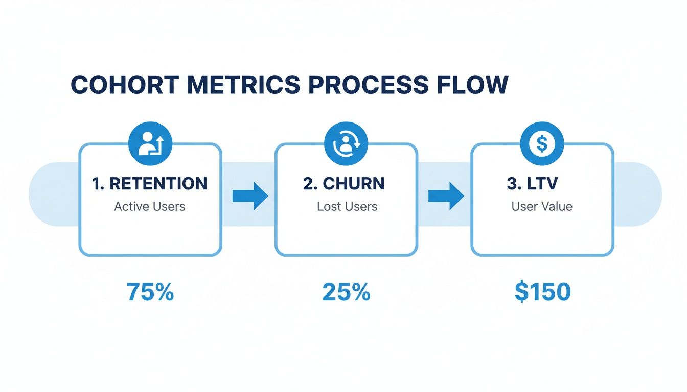
This flow shows you exactly how a cohort's value grows over time. It visualizes the constant balance between keeping customers (75% retention in this example) and losing them to churn (25%), which ultimately determines their lifetime value ($150).
You can dive deeper into building a comprehensive overview of your store's health with a well-designed eCommerce analytics dashboard.
From Data to Decisions in Seconds
The real power here is how quickly you get clarity. Good tools don't just present data; they make it immediately understandable, even if you're not an analyst.
The goal is empowerment. Instead of being buried in rows and columns, you get a clear, story-driven insight about your customer behavior. You can instantly spot your best-performing cohorts and see which marketing efforts are actually driving long-term value.
This shift—from manual crunching to automated storytelling—is what gives modern DTC brands their competitive edge. It frees you up to focus on strategy and action, not data entry.
Turn Your Cohort Insights Into Profitable Actions
Data is only valuable when it leads to revenue. Staring at a colorful cohort chart is one thing; turning those little boxes into tangible, profitable actions is another game entirely. This is where you move from just looking at data to actually using it to boost AOV, LTV, and profitability.
Let's walk through a couple of real-world scenarios I see all the time with Shopify brands to show you how these insights become growth.
Scenario 1: The Leaky Bucket Campaign
You're running a campaign on Meta and the initial ROAS looks pretty good. But then you run an acquisition cohort analysis and see something ugly: customers from your "Summer Glow" campaign have a massive 70% churn rate after just one month. They buy once, then they're gone.
- The Insight: The ad creative or the offer is probably attracting deal-seekers with zero loyalty. There's a big disconnect between what the ad promised and what the customer actually experienced.
- The Action: First, you’ve got to tweak that ad messaging immediately to set more realistic expectations. At the same time, you spin up a targeted welcome series in Klaviyo just for this cohort, giving them a compelling reason to stick around and make a second purchase that reinforces your brand’s value beyond a one-off discount.
Scenario 2: The Hidden Gem Product
While digging through your data, you spot something interesting. A behavioral cohort of customers whose very first purchase was your 'Organic Face Oil' has a lifetime value (LTV) that is 2x higher than any other first-product cohort. These aren't just customers; they're your future brand advocates in the making.
This is what we call a "gateway product." It's an item that serves as the perfect entry point to your most valuable, long-term customer relationships. Finding these is a goldmine for sustainable growth.
- The Insight: This product isn't just another SKU in your catalog—it's a strategic asset that drives incredible loyalty and high LTV.
- The Action: An insight this strong demands an immediate shift in your marketing. You start featuring the 'Organic Face Oil' more prominently on your Shopify homepage, build new top-of-funnel ad campaigns around it, and create content that draws in more of these high-value customers right from the start.
For a long time, uncovering these kinds of patterns was a manual, painstaking process. This type of analysis really became non-negotiable for Shopify brands after the massive Black Friday booms back in 2018. The data showed that holiday cohorts often had a 55% higher LTV than cohorts from the middle of the year. One analysis even found that customers from promotional months retained at 48% after six months, compared to just 29% for regular cohorts. That discovery prompted smart brands to start timing their big launches around these peaks. If you want to go deeper on this, you can check out the full analysis on Statsig.com.
Today, modern analytics platforms like MetricMosaic use AI to automatically surface these kinds of story-driven insights. Instead of you having to hunt for clues, the platform flags these opportunities for you, helping you make faster, smarter decisions that actually boost your bottom line.
The Future of Analytics Is Conversational and Predictive
Just looking at cohort charts is only half the battle. The real magic happens when you can interact with your data and get ahead of trends instead of just reacting to what’s already happened. This is where the next wave of AI-powered analytics tools is completely changing the game for Shopify brands.
The old way was staring at a static chart, trying to connect the dots yourself. The new way is dynamic and proactive—built for busy founders who need clear answers, not just more data points to sift through.
From Static Reports to Active Conversations
What if you could ask your store’s data questions in plain English, just like you’d ask a data analyst on your team? That’s the core idea behind conversational analytics. Instead of spending hours digging through reports, you can just ask your platform directly:
- "Show me the LTV of customers from our spring sale versus last year's."
- "What was the 90-day retention for our TikTok campaign cohort?"
- "Compare the churn rate of customers who used a discount code to those who didn't."
This approach, which is central to platforms like MetricMosaic, tears down the barrier between you and your insights. It replaces manual data crunching with immediate, clear answers, making sophisticated analysis accessible to everyone on your team.
Predictive Insights That Drive Proactive Growth
The next leap forward is even more powerful: predictive analytics. This is where AI doesn't just show you what happened in the past; it tells you what’s likely to happen next.
An AI-powered analytics platform can forecast a new cohort's future value based on their early behavior. Even more critically, it can identify customers at risk of churning before they actually leave.
This turns your analytics tool from a simple reporting dashboard into a strategic co-pilot for growth. It surfaces proactive, story-driven recommendations you can act on immediately to boost profitability and keep customers coming back, turning your store's data into a genuine competitive advantage.
Got Questions? Let's Talk Cohorts.
Even after you get the hang of cohort analysis, a few practical questions always pop up. Here are some of the most common ones I hear from Shopify founders when they first start digging into their customer data this way.
How Often Should I Be Looking at This?
For most DTC brands, running a cohort analysis once a month is the sweet spot. This gives you enough data to spot real trends without getting lost in the daily noise. It's the perfect rhythm for checking the impact of your recent marketing efforts and making smart tweaks to your retention strategy.
Of course, if you just dropped a new product or launched a big campaign, you might want to peek at it weekly for a little while. This can give you a quick read on how customers are responding right out of the gate.
What's a "Good" Retention Rate, Anyway?
This is the million-dollar question, and the honest answer is: it depends. There’s no single number that works for everyone because it varies wildly based on your industry, product, and price point.
A subscription box company might aim for 60-70% retention after three months. But for a brand selling skincare, a 25-35% repeat purchase rate in that same window would be fantastic.
Ultimately, the most important benchmark is your own past performance. Are you improving month over month? That's the real goal.
Can I Just Use My Shopify Data?
You can, but you’ll only be seeing part of the story. Using your Shopify sales data alone will let you run a basic analysis to see how many customers come back to buy again over time. It’s a good starting point.
But the real magic happens when you add more context. To figure out which marketing channels are actually bringing you your best, most loyal customers, you need to pull in data from your ad platforms (like Meta and Google) and your email tool (like Klaviyo). That’s how you uncover the insights that actually move the needle on CAC, LTV, and profitability.
Ready to stop guessing and start seeing the real story your numbers are trying to tell you? MetricMosaic pulls all your Shopify data together in one click, turning complicated cohort analysis into clear, story-driven insights you can actually use to grow faster.
Find out which campaigns are really driving profitable growth. Start your free trial today and finally see what your data has been trying to tell you.