What Is a Cohort Analysis for Your Shopify Store?
Learn what is a cohort analysis and how it reveals hidden customer trends to boost retention and lifetime value for your DTC brand.
Think of cohort analysis as your secret weapon for understanding customer behavior. For your Shopify store, it's a way to group customers together based on a shared characteristic—usually when they made their first purchase.
You might group all the customers who first bought from you in January, then another group for February, and so on. Why? Because it lets you track how these specific groups behave over time, giving you a crystal-clear picture of customer loyalty and long-term value. It’s hands down the best way to get a real handle on customer retention and stop relying on misleading, surface-level metrics that hide what's really going on in your business.
Your Hidden Customer Retention Problem
So, you had a record sales month. Traffic is up, revenue looks great in your Shopify dashboard, and your latest ad campaign seems to be a hit. But are those top-line numbers telling you the whole story?
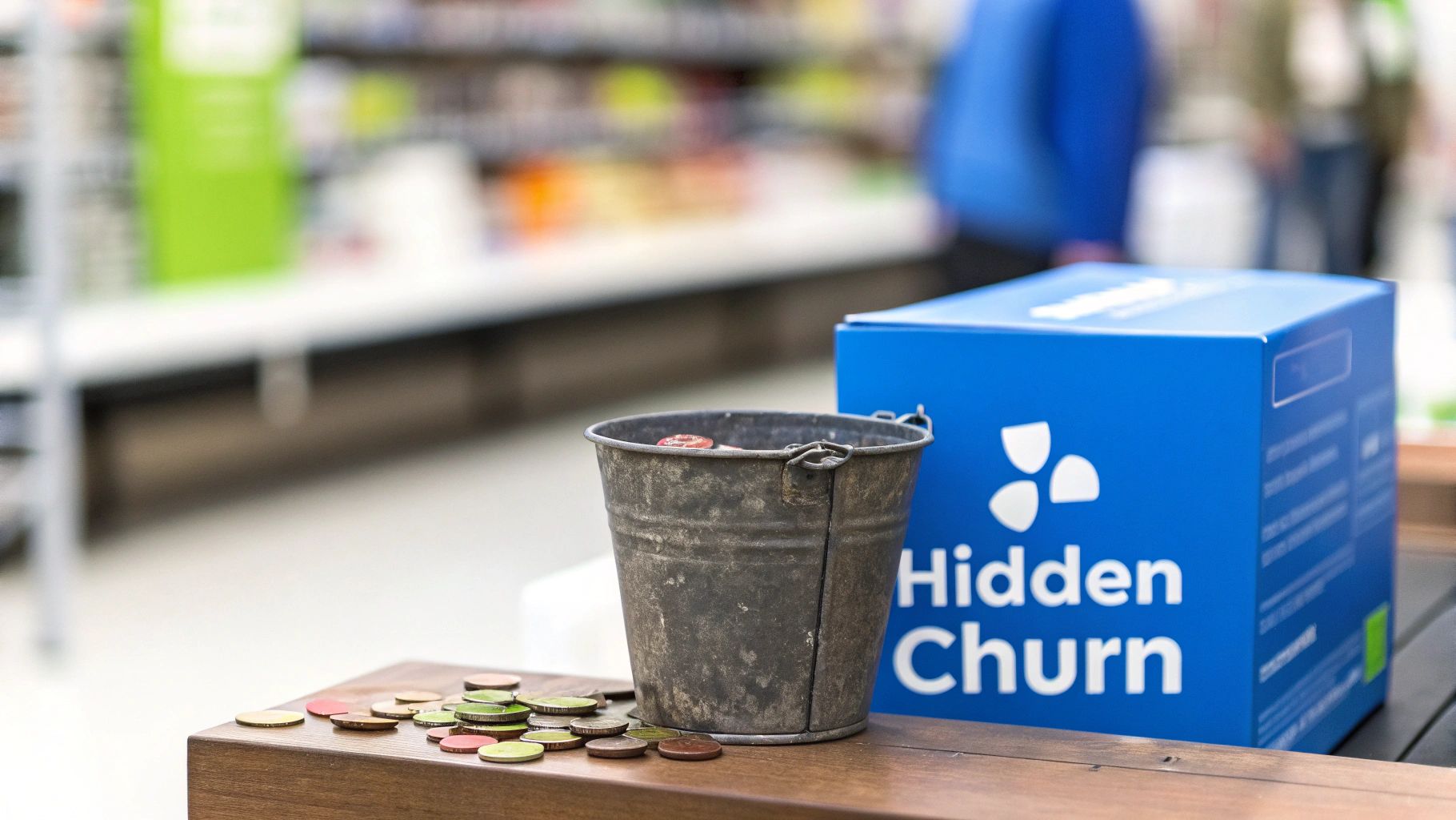
For many Shopify founders, they aren't. Lurking beneath those impressive reports is often a "leaky bucket"—a constant churn of new customers who buy once and never come back. You're pouring new customers in the top, but they're slipping out through holes in the bottom just as fast. It’s a common, and very dangerous, blind spot that makes scaling profitably feel impossible.
Standard analytics can give you a false sense of security while customer churn silently eats away at your profits and sends your customer acquisition costs (CAC) through the roof.
Beyond Surface-Level Metrics
The real question isn't just "how many sales did we make?" It's "which customers are sticking around, and why?" That shift in thinking is what separates the Shopify brands that stall from the ones that achieve sustainable, profitable growth.
Relying only on metrics like total monthly revenue is like trying to navigate a ship with a broken compass. Sure, it points in a general direction, but you’re missing all the crucial details needed to actually reach your destination and grow your DTC brand.
A DTC brand might celebrate a 15% increase in monthly revenue but completely miss that 70% of new customers from that month never make a second purchase. This is the leaky bucket in action, and it's a problem that traditional reporting will never show you.
This is exactly why cohort analysis is so vital. It’s like putting on a pair of glasses that lets you see your customer base in high definition. By grouping customers, you can accurately track their behavior and finally understand the true health of your business. With AI-powered tools, this process is no longer about manual data crunching; it's about getting clear answers instantly.
The True Cost of Ignoring Churn
Letting hidden churn go unchecked is a recipe for disaster. When you don't know who is leaving or why, you're essentially flying blind, which leads to a handful of profit-killing problems for your Shopify store:
- Wasted Ad Spend: You keep pouring money into channels that bring in one-and-done buyers with low lifetime value (LTV).
- Ineffective Retention Strategies: You're just guessing. Your emails and offers miss the mark because they aren't based on how customers actually behave.
- Decreasing LTV: Your customer lifetime value flatlines because you aren’t building a base of loyal, repeat purchasers.
- Unsustainable Growth: Your business becomes stuck on a hamster wheel, forced to spend more and more on acquiring new customers just to replace the ones you’re constantly losing.
To get ahead of this, you first have to diagnose the problem. A great starting point is to explore an AI-powered churn rate analysis to get a baseline for your customer health. From there, cohort analysis gives you the framework to not only spot these issues but to build a data-driven strategy that turns one-time shoppers into lifelong fans.
Getting to Grips with Cohort Analysis
Forget the scary charts and data-science jargon for a second. At its heart, cohort analysis is just a way to tell a much clearer story about your customers. It’s about answering one simple, crucial question: "Of all the people who bought from my Shopify store this month, how many are actually sticking around?"
I like to think of customers like graduating classes. Everyone who made their first purchase in January is in the "January Class." Everyone who joined in February is the "February Class," and you get the idea.
By tracking each of these "classes" separately over time, you start to see which groups come back the most, spend more, and become your most valuable fans. It’s a simple shift in thinking, but it moves you from staring at a messy crowd of sales data to seeing distinct groups with their own unique stories.
The Two Main Flavors of Cohort Analysis
The "graduating class" analogy is a great starting point, but things get really interesting when you start slicing your cohorts in different ways. There are two main approaches here, and each one gives you a totally different lens for understanding what keeps your customers coming back. AI-powered analytics tools can automate this slicing and dicing, giving you clarity without the manual work.
Let's break them down in plain English.
1. Acquisition Cohorts
This is the classic approach and lines up perfectly with our "graduating class" example. It's the most common starting point for a reason: it's simple and incredibly powerful.
Acquisition Cohorts group customers together based on when they first became a customer. This is usually by the day, week, or month of their first purchase.
For a DTC brand on Shopify, this lets you create groups like:
- The "Black Friday 2023" Crew: Everyone who made their first purchase during that chaotic sales weekend.
- The "January 'New Year, New Me'" Group: All the new customers who joined at the start of the year.
- The "Week 3 TikTok Push" Cohort: Customers who came in during that specific week when you went all-in on a TikTok campaign.
Tracking these groups separately finally lets you answer the real questions that impact ROAS and LTV. "Are Black Friday shoppers just one-and-done discount hunters?" "Did that new welcome email series we launched in February actually make those customers more loyal?"
2. Behavioral Cohorts
This is where you can get a lot more surgical with your analysis. Instead of grouping people by when they showed up, you group them by what they did.
Behavioral Cohorts group customers based on a specific action they took (or didn't take) within a certain timeframe.
This approach is killer for understanding what actions signal a high-value customer. For your brand, these cohorts could look like:
- The "WELCOME10 Discount" Crew: Everyone who used that first-time buyer discount code.
- The "Skincare Quiz Takers": All the customers who completed your product recommendation quiz before their first purchase.
- The "First Order Over $100" Club: Customers whose very first purchase was a big one.
Analyzing these groups helps you connect the dots between actions and loyalty. Do people who take the quiz stick around longer? Are the big first-time spenders more likely to come back? This is how you find out what's really driving long-term value and profitability.
This method of grouping by acquisition date became a go-to for analytics in the early 2010s, especially as SaaS and mobile apps exploded and needed a better way to measure user stickiness. For instance, a DTC brand might find their Q4 holiday shoppers showed a 25% higher 6-month retention rate compared to a slow Q1 cohort that dropped to just 12%. You can discover more insights about cohort analysis applications to see how powerful this can be for spotting seasonal trends.
At the end of the day, both acquisition and behavioral cohorts are about turning messy, high-level data into a clear narrative. Instead of just knowing your store's overall repeat purchase rate, you can pinpoint that your "Black Friday" group has a terrible repeat rate, but your "Skincare Quiz" group is full of loyal, high-LTV customers. That’s the kind of actionable insight that tools like MetricMosaic are built to surface automatically, helping you make smarter moves without ever wrestling with a spreadsheet.
How to Read a Cohort Chart and Find Opportunities
Alright, we’ve covered what cohorts are. Now for the fun part: seeing them in action. The centerpiece of any good cohort analysis is the cohort chart, which you’ll often hear called a retention table.
At first glance, it might look like just another spreadsheet. But it’s really a treasure map, pointing you toward hidden profit and customer loyalty. Think of it as a report card for each of your customer "graduating classes." Each row is a different class (like the "January Class"), and the columns track how they're doing over time. Learning to read this chart is the first step toward turning raw data into a real competitive advantage for your Shopify store.
Deconstructing the Cohort Retention Table
Let's break down the three key pieces of a typical retention table. Once you get these, you'll be able to look at any cohort chart and know exactly what you’re seeing.
This screenshot from CXL shows a classic retention table. It’s the visual engine of cohort analysis.
The Rows (Your Cohorts): Each row is a distinct group of customers. In this example, they’re grouped by the month they made their first purchase. The first column gives you the cohort's name (e.g.,
Dec 2015) and the total number of people in that group.The Columns (The Timeline): The columns, moving left to right, show the passage of time since that cohort first signed up or bought something. Month 0 is their starting month. Month 1 is the next month, Month 2 is two months later, and so on.
The Cells (The Retention Rate): This is where the magic happens. Each cell shows the percentage of customers from a specific cohort (the row) who came back to buy again during a specific timeframe (the column). The colors usually form a heatmap—darker shades mean higher retention, while lighter shades show where customers are dropping off.
The most obvious thing you’ll see is that diagonal fade from dark to light. That just shows that retention naturally declines over time for every group. Your goal is to make that fade happen as slowly as possible.
Spotting the Stories in the Data
Once you’re comfortable with the layout, you can start looking for the stories hidden in the numbers. This is where you graduate from just looking at data to actually understanding your customers. The patterns you spot will tell you what’s working, what isn’t, and where your biggest opportunities for boosting AOV, LTV, and retention are hiding.
You’re basically looking for two kinds of patterns:
Vertical Patterns (Column Analysis): Reading a column top-to-bottom lets you compare different cohorts at the exact same point in their journey. For instance, scanning the Month 1 column shows you which acquisition month brought in the most loyal customers one month after they joined.
Horizontal Patterns (Row Analysis): Reading a row left-to-right tracks the journey of a single cohort over time. This helps you understand the long-term value and decay rate of a specific group, like all the customers you acquired during your Black Friday sale.
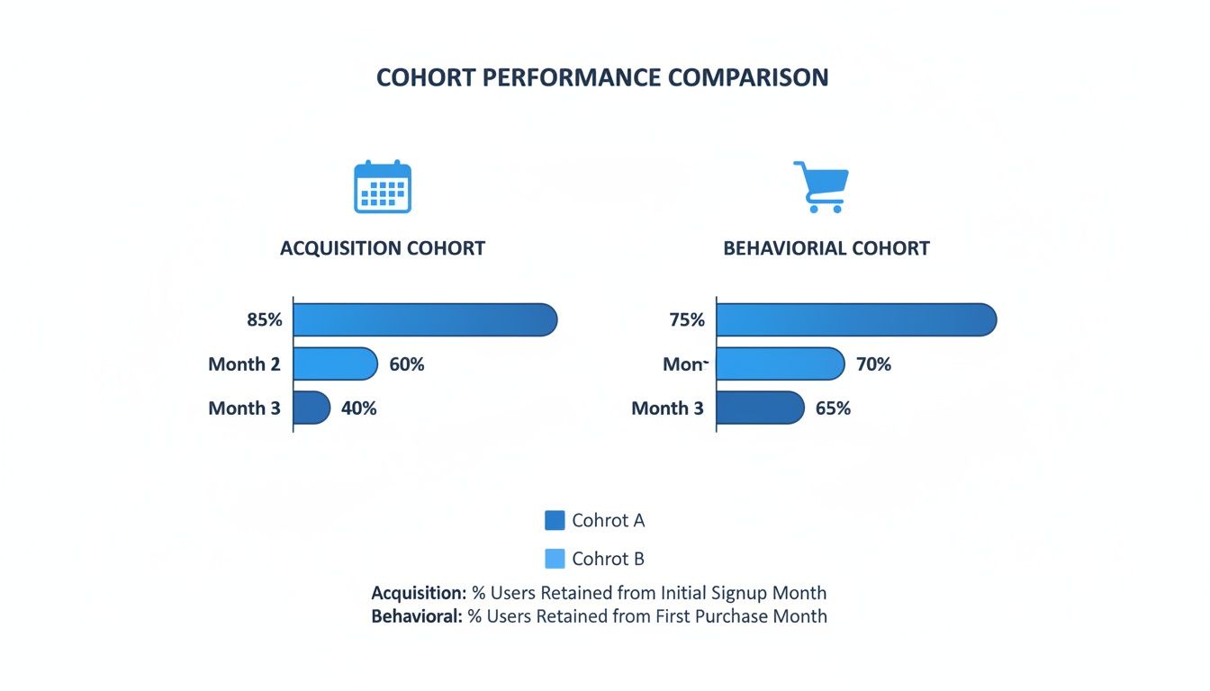
This chart shows that while both types of cohorts see a drop-off, behavioral cohorts (like first-time buyers who also signed up for SMS) often have a much stronger and more stable retention curve over the long haul.
Finding Your "Smile" Curve
A healthy retention curve often looks like a "smile." It drops off at the beginning (which is totally normal), but then it flattens out and might even tick up slightly as your most loyal, die-hard customers stick around. This is a great sign—it means you have a solid product and a healthy base of repeat buyers.
On the flip side, a "frowning" curve is a major red flag. This is when your retention rate just keeps dropping month after month, never leveling off. It signals that your store is failing to build any long-term relationships, forcing you onto that expensive hamster wheel of constantly acquiring new customers just to replace the ones who keep leaving.
With a tool like MetricMosaic, you don't have to build these charts by hand or squint to find patterns. The platform generates these visuals instantly and even uses story-driven data to tell you in plain English which cohorts are performing best and why. It turns a complex analysis into a clear, actionable summary, so you can focus on growing your brand, not wrestling with spreadsheets.
Putting Cohort Analysis into Action for Your Store
Alright, you get the charts and the theory. But how does this actually make you more money? Let's get practical and walk through a few scenarios that every Shopify founder runs into. Cohort analysis isn't just for spotting trends—it’s about tying those trends to real-world decisions that pump up your bottom line.
This is where you stop being reactive and start getting proactive. You're using real data from your Shopify store to steer the ship instead of just guessing what works. Every insight you pull from a cohort becomes a lever you can use to improve the metrics that matter: ROAS, customer acquisition cost (CAC), AOV, and lifetime value (LTV).

Optimizing Ad Spend Across Channels
Here's a classic one: you're running ads on Meta (Facebook and Instagram) and TikTok. Both seem to be bringing in sales, but which channel is really giving you more valuable, profitable customers?
This is a perfect job for an acquisition cohort analysis.
- The Setup: Simple. Create two cohorts: one for all new customers from Meta ads in January, and another for all new customers from TikTok in January.
- The Analysis: Now, watch them. Track the repeat purchase rate and average order value (AOV) for both groups over the next six months.
- The Insight: You might find that while TikTok has a lower initial CAC, the Meta cohort has a 30% higher LTV after six months. Why? Because they come back more often and spend more when they do. This tells you that paying a bit more to acquire a Meta customer is actually more profitable in the long run.
- The Action: With this data in hand, you can confidently shift more of your budget to Meta, knowing it delivers stickier, higher-value customers. You might also tweak your TikTok creative to attract buyers with higher intent.
Evaluating Discount Code Strategies
Discount codes can feel like a necessary evil. Sure, they drive a quick spike in sales, but are they bringing in loyal fans or just one-and-done bargain hunters who tank your margins? Let's find out.
A behavioral cohort analysis will give you the answer.
- The Setup: Take your Black Friday customer group and split it into two behavioral cohorts. The first group used a discount code on their first purchase; the second paid full price.
- The Analysis: Compare the retention curves and lifetime value of both cohorts.
- The Insight: The numbers might be stark. Maybe the full-price group has a 40% better retention rate by Month 3 and a much higher LTV. The discount crew? A steep drop-off right after that first purchase.
- The Action: This is a clear signal that your discount strategy is attracting the wrong kind of customer. You could test a smaller discount, limit it to certain segments, or swap it for a value-add offer like free shipping to attract people who love your brand, not just the deal.
Identifying Product-Driven Loyalty
Let's say you launched a new hero product—a "Glow Serum"—in March. Sales look great in your Shopify reports, but is it actually creating loyal customers or just a flash in the pan?
- The Setup: First, compare the March acquisition cohort (when the serum launched) to your January and February cohorts. Then, go a step further and create a behavioral cohort of everyone whose first purchase included the Glow Serum.
- The Analysis: You might notice the March cohort has a 15% higher retention rate at Month 2. But when you look at the "Glow Serum" behavioral cohort, you see they're outperforming everyone.
- The Insight: That new product isn't just selling well—it's your gateway to loyalty. It's the product that gets people hooked.
- The Action: Double down on it. Feature the Glow Serum everywhere—in your welcome series, in your ads, and in product bundles. Make it the first thing new customers see to maximize your chances of turning them into repeat buyers.
To help visualize this, here’s a quick table showing how these different use cases play out in the real world for a DTC brand.
DTC Cohort Analysis Use Cases and Key Metrics
| Cohort Analysis Use Case | Example Cohort Group | Primary KPI Impacted |
|---|---|---|
| Marketing Channel ROI | Customers from Meta vs. TikTok ads in Q1 | Customer Lifetime Value (LTV) |
| Discount Effectiveness | Black Friday shoppers (Discount vs. Full Price) | Customer Retention Rate |
| Product Launch Impact | Customers who bought "New Product X" first | Repeat Purchase Rate |
| Website Experience | Users from updated PDP vs. old PDP | Conversion Rate (2nd purchase) |
| Seasonal Campaign Value | Customers acquired during Holiday Sale | Average Order Value (AOV) |
| Email Onboarding Success | Users from "Welcome Series A" vs. "B" | Time to Second Purchase |
Each row gives you a clear playbook: isolate a group based on a specific event or behavior, track them over time, and see how that initial experience impacts their long-term value to your business.
The idea of grouping customers by behavior isn't new. One of the most famous examples came from Target back in 2012. By creating cohorts based on purchasing patterns—like a sudden switch to unscented lotion—they could predict pregnancy with an incredible 87% accuracy and send perfectly timed coupons. This reportedly boosted sales in their baby department by 15-25% for those targeted groups.
Once your cohort analysis highlights these distinct customer groups, checking out actionable customer segment examples can give you a ton of ideas for turning these insights into marketing campaigns that actually work.
How Modern Tools Make Cohort Analysis Effortless
Feeling a bit overwhelmed by the idea of crunching all this data? The good news is, you don’t have to. The days of wrestling with gnarly spreadsheets and manually pulling data from your Shopify store are officially over. Modern AI-powered analytics tools have made cohort analysis accessible to everyone.
The old way was a total nightmare, especially for busy DTC founders. It meant exporting massive CSV files, building pivot tables, and fighting with formulas just to get a basic retention table. Not only was this process painfully slow, but it was also incredibly prone to human error. By the time you got the insights, they were often already outdated.
Now, a new, automated approach changes everything. Next-generation platforms built for Shopify brands, like MetricMosaic, do all the heavy lifting for you, turning complexity into clarity.
From Manual Crunching to Instant Clarity
Instead of burning hours in spreadsheets, these AI-driven tools connect directly to your Shopify data and other sources like Meta Ads and Klaviyo. They instantly generate the cohort charts we’ve been talking about, visualizing your customer retention in seconds.
But it goes way beyond just spitting out charts. These platforms use AI to surface predictive insights that a spreadsheet never could. Imagine getting an alert that says, "Your 'Black Friday' cohort is at high risk of churn this week," along with a smart recommendation on how to re-engage them. This is the power of moving from reactive reporting to proactive, intelligent action.
This is where the real power of modern analytics comes in. It turns a complex, time-sucking task into a simple, powerful way to finally get answers from your data.
AI-driven tools can deliver story-driven summaries in plain English, explaining why certain cohorts are performing better. This means less time guessing and more time making confident decisions that actually boost your ROAS, LTV, and overall profitability.
AI Delivers Actionable Intelligence, Not Just Data
Modern analytics don't just show you what happened; they help you understand why and what you should do next. This capability is proving essential across the board. For example, Shopify’s own analysis of 1.75 million merchants found their Black Friday acquisition cohort had a 32% 12-month retention rate—blowing past the 22% from non-peak periods. That single insight led to targeted nurturing campaigns that delivered a 22% revenue uplift. You can read more about powerful cohort analysis examples that show how this works in the real world.
For your Shopify store, this translates to:
- Automated Anomaly Detection: The AI flags when a cohort’s behavior deviates from the norm, good or bad, so you never miss a critical change.
- Conversational Analytics: You can just ask questions in plain English, like "Show me the LTV of customers from my latest TikTok campaign," and get an instant answer.
- Predictive Forecasting: The system can forecast future LTV or churn for new cohorts, helping you optimize your ad spend in real-time.
By turning complexity into clarity, these tools empower you to get actionable answers from your Shopify data in minutes, not days.
From Insight to Action
Alright, you've made it this far. You now understand what a cohort analysis is, and that alone is a huge leap forward. But knowledge is just potential energy—it’s only powerful when you actually use it.
The insights buried in your Shopify data are the key to unlocking sustainable, profitable growth. This is how you move your brand from guesswork to confident, data-driven decisions. This final step is all about building a clear, actionable roadmap to apply what you've learned.
The core takeaway is simple: analyzing customer cohorts is how you build a resilient DTC business. It lets you stop chasing vanity metrics and start measuring what truly drives long-term value and profitability.
Your Four-Step Action Plan
Don't get overwhelmed. The goal here is to move from theory to application quickly, find one actionable insight, and build momentum.
Here’s a simple checklist to get you started on your first cohort analysis.
Define Your Most Pressing Question
Don't try to boil the ocean. Pick one critical question that directly impacts your bottom line. Something like, "Which of my marketing channels—Meta or TikTok—delivers customers with the highest LTV after three months?"Choose the Right Tool for the Job
You could try to do this manually in a spreadsheet, but it’s slow, tedious, and prone to errors. An AI-powered analytics platform like MetricMosaic connects directly to your Shopify store and automates the entire process. You get instant cohort charts without the data-crunching headache, which is a lifesaver for busy founders who need answers fast.Find One Actionable Pattern
Once you have your first report, don't look for a dozen insights. Just find one clear, undeniable pattern. Maybe you’ll see that your "Black Friday" cohort has terrible retention, or that customers who buy a specific product first tend to stick around 50% longer than anyone else.Formulate a Hypothesis and Run a Test
Now, turn that one pattern into a simple test. If your data shows customers who use a "WELCOME10" discount code churn quickly, your hypothesis might be: "Replacing our 10% discount with a 'Free Shipping' offer will attract higher-value customers." Run the test, measure the results with a new cohort, and repeat the process.
This simple, structured approach transforms cohort analysis from an academic exercise into a practical growth engine. It empowers you to systematically improve your marketing spend, enhance customer retention, and build a more profitable business—one data-backed decision at a time.
Frequently Asked Questions
Even with a solid game plan, some questions always seem to pop up. Here are a few of the most common ones we hear from Shopify founders when they first start digging into cohort analysis.
What Is the Difference Between a Cohort and a Segment?
It’s an easy one to mix up. Think of it like this: a cohort is a group of people who all did the same thing at the same time. For example, everyone who made their first purchase during your Black Friday sale. Their starting line is identical.
A segment, on the other hand, is a group defined by shared traits that can change over time. Your "VIP Customers" who have spent over $500 would be a segment. Someone can join or leave that group at any time.
So, while all cohorts are a type of segment, not all segments are cohorts. Cohorts are your go-to for seeing how customer behavior evolves from a specific starting point.
How Often Should I Run a Cohort Analysis?
For a fast-moving DTC brand, running a monthly cohort analysis is a great rhythm to get into. It’s frequent enough to see how your marketing campaigns, product drops, and site changes are affecting customer loyalty.
That said, if you’re in the middle of a big campaign or testing a new ad channel, you might want to peek at weekly or even daily cohorts. This gives you much faster feedback on what's working. Of course, AI-powered tools like MetricMosaic automate this, giving you a real-time pulse on customer health without any of the manual grunt work.
What Is a Good Retention Rate for a Shopify Store?
This is the million-dollar question, and the honest answer is… it depends. A "good" retention rate is all over the map depending on your industry, what you sell, and how often people realistically need to buy it.
A brand selling consumables like coffee might reasonably expect 20-30% of customers to come back within three months. But a store selling high-end furniture? Their repeat purchase rate will naturally be much, much lower.
The key isn't to chase some arbitrary industry benchmark. It's to consistently improve your own retention rate over time. Your cohort analysis is the best scorecard you have for measuring that progress.
Can Cohort Analysis Help with LTV and CAC Payback?
Absolutely. In fact, this is where it really shines. By tracking the cumulative revenue from an acquisition cohort—say, all the new customers you got from your January Meta ads—you can pinpoint the exact moment that group becomes profitable.
This is the data you need to calculate your LTV-to-CAC ratio and your CAC payback period. It helps you answer the most critical question in ecommerce: "Are my marketing dollars actually making me money in the long run?" It’s what helps you move from just buying customers to acquiring the right ones.
Ready to stop guessing and start making data-driven decisions that grow your Shopify store? MetricMosaic is your AI-powered growth co-pilot, turning your store's data into clear, actionable insights. Get instant cohort analysis, LTV forecasts, and story-driven recommendations that boost profitability. Start your free trial today.