How to Improve Ecommerce Conversion Rates: An AI-Powered Guide for Shopify Founders
how to improve ecommerce conversion rates: Learn proven UX, copy, and checkout tactics to convert more visitors today.
As a Shopify founder, you know the feeling. You pour your budget into driving traffic, only to watch most visitors vanish without buying. It's not just a missed sale; it's a hit to your ROAS and a waste of marketing dollars you can't get back. The cycle is frustrating, and it usually points to a bigger problem: your data is fragmented across Shopify, Google Analytics, and your ad platforms, making it impossible to see the real story.
This guide isn't about chasing generic benchmarks or testing random button colors. It's about using the power of AI-driven analytics to systematically hunt down the friction points killing your sales and turn that complexity into clear, actionable insights. We'll show you how to move from data overload to a focused strategy that boosts conversion, AOV, LTV, and your bottom line.
Why Your Shopify Store Is Leaking Revenue

You're trying to connect the dots between Shopify sales, Meta ad spend, and Klaviyo email flows. It feels like solving a puzzle with half the pieces missing. You're left guessing: Is it the product page? The shipping costs? The mobile experience? Without a single source of truth, every decision feels like a shot in the dark, and every bounce is a tangible hit to your profitability.
This painful cycle is precisely why the old way of doing analytics—manually crunching numbers in spreadsheets or staring at confusing dashboards—is broken for modern DTC brands.
The Problem with Generic Benchmarks
You've seen the articles claiming a "good" ecommerce conversion rate is between 2% and 4%. For a growing Shopify brand, clinging to these generic numbers is a strategic mistake. Your store's performance is unique, shaped by critical factors that benchmarks ignore:
- Your Industry: A store selling luxury jewelry will never have the same conversion baseline as one selling fast-fashion t-shirts.
- Your Price Point: Higher ticket items naturally have a longer consideration phase and a lower conversion rate. That's just the reality of DTC.
- Your Traffic Sources: A warm lead from an email campaign will always convert better than a first-time visitor from a cold TikTok ad.
Without this context, industry benchmarks are just noise. They don't tell you why people are leaving or where the biggest leaks in your sales funnel really are.
The real goal isn't hitting an arbitrary number. It's to systematically improve your own baseline. A jump from a 1.5% to a 2% conversion rate might not sound earth-shattering, but that's a 33% increase in revenue from the exact same traffic, which directly improves your ROAS and CAC.
From Data Overload to Actionable Clarity
This is where next-generation, AI-powered analytics platforms like MetricMosaic are a game-changer for DTC founders. They replace manual data crunching by unifying all your data sources and using AI to tell you the story behind the numbers. Instead of throwing charts at you, they surface actionable insights in plain English.
Imagine your analytics tool delivering a predictive insight like, "Your add-to-cart rate for mobile users on the new collection is 40% lower than your site average, pointing to a potential UX issue." This is what happens when conversational analytics transforms fragmented data into a clear diagnosis. It lets you stop guessing and start fixing the real conversion killers draining your revenue.
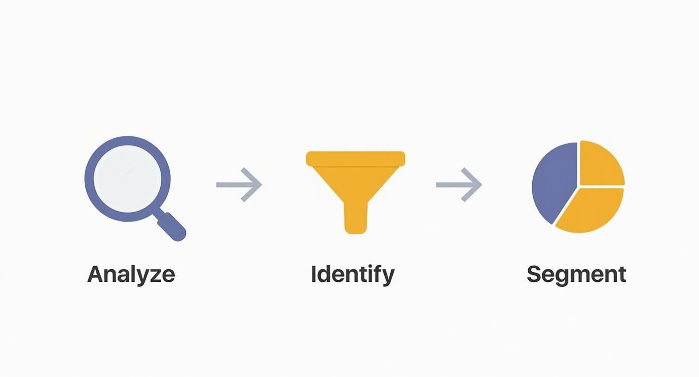
Diagnose Your Biggest Conversion Bottlenecks
Before you A/B test a button color, you have to know where your Shopify store is actually leaking cash. Trying to boost your conversion rate without a proper diagnosis is like trying to fix an engine blindfolded. You need to move past vanity metrics and dive into the data that tells the real story of your customer journey.
For most founders, sifting through endless Google Analytics reports to find one actionable insight feels like searching for a needle in a haystack. The goal isn't just to see what's happening, but to truly understand why visitors are abandoning their carts.
Moving Beyond Generic Benchmarks
It’s tempting to measure your store against a generic industry benchmark, but as we've covered, that’s a flawed approach. Your most important benchmark is your own historical performance. What’s critical is setting a baseline for your Shopify store and focusing on improving your own numbers across AOV, LTV, and retention. For context, here’s how much conversion rates can vary.
Ecommerce Conversion Rate Benchmarks by Industry
Seeing the performance gap between different sectors drives home why context is critical. A 1.9% conversion rate might be fantastic in luxury jewelry, while that same number would be a red flag for a skincare brand. This table helps you set realistic goals by showing you the playing field you're actually on.
| Industry | Average Conversion Rate | Optimization Focus |
|---|---|---|
| Personal Care & Cosmetics | 6.8% | Product education, social proof, and subscription offers. |
| Food & Beverage | 5.5% | High-quality imagery, clear nutritional info, and easy reordering. |
| Electronics | 3.5% | Detailed specs, comparison tools, and trust-building reviews. |
| Home & Garden | 3.2% | Lifestyle imagery, user-generated content, and clear dimensions. |
| General Shopify Average | 2.5% - 3.0% | Mobile experience, streamlined checkout, and shipping transparency. |
| Fashion & Jewelry | 1.9% | High-res visuals, accurate sizing guides, and flexible return policies. |
Ultimately, the real starting point is digging into your own funnel, from the first ad click to the final "thank you" page, to understand your unique customer behavior.
Analyzing Your User Journey Funnel
Your conversion funnel is the path a visitor takes on their way to making a purchase. Mapping it out shows you exactly where you’re losing people and hurting your profitability.
A standard Shopify funnel looks something like this:
- Visited Site: The total number of users who land on your store.
- Viewed Product: People who click through to a specific product page.
- Added to Cart: Someone hits that "Add to Cart" button.
- Reached Checkout: They actually start the checkout process.
- Purchased: They complete the transaction.
Calculating the drop-off rate between each step immediately spots your biggest problem. A huge drop from "Viewed Product" to "Added to Cart" means your product pages aren't converting. A mass exodus after "Reached Checkout" screams there's friction in your payment or shipping process.
Doing this manually across different devices, traffic sources, and customer segments can take hours. This is where modern analytics tools become a founder's best friend.
An AI-powered platform like MetricMosaic automatically builds your funnel and surfaces these insights in plain English. Instead of you digging through reports, it proactively tells you, "Your drop-off rate between 'Add to Cart' and 'Checkout' is 25% higher on mobile than on desktop." Now you have a clear, high-impact problem to solve.
Identifying High-Exit Pages and Segments
Not all pages or visitors are created equal. A solid conversion audit means identifying which pages are chasing people away and which customer segments are underperforming.
You need to ask sharp questions to uncover hidden patterns that are killing your CAC and ROAS:
- Which pages have the highest exit rates? Are people bailing from your collection pages, or is one specific product page the culprit?
- How does behavior change by device? Are mobile users getting frustrated and leaving? Maybe your CTA buttons are too small on a phone screen.
- Which traffic sources are underperforming? Are visitors from your Meta ads converting far worse than those from your Klaviyo emails? This might signal a mismatch between your ad creative and your landing page.
Without the right tools, answering these questions means clumsily cross-referencing multiple reports in clunky spreadsheets. It’s tedious and error-prone.
The next generation of AI analytics platforms handles this for you, automatically segmenting your data and flagging anomalies. Imagine getting an alert that says, "Your new collection has a 40% lower add-to-cart rate on Android devices compared to iOS." That single, story-driven insight just saved you hours of manual data crunching and gave you a specific, high-impact problem to fix. This is the power of turning complexity into clarity.
Build Your High-Impact Experiment Roadmap
You've dug through your Shopify data and identified your conversion bottlenecks. This is where most founders get excited, make random site changes, and wonder why their conversion rate hasn’t budged. A scattered approach is a fast track to wasted time and inconclusive results.
To truly improve your conversion rates, you need a prioritized roadmap. It’s not about throwing spaghetti at the wall; it's about making calculated bets based on data, focusing your limited resources where they'll make the biggest impact on profitability. A simple but powerful way to get organized is by using a prioritization framework like the PIE model.
Prioritize Using the PIE Framework
Think of this as your strategic filter. Instead of going with your gut, you'll score each potential test on a scale of 1 to 10 for three key criteria:
- Potential: How much room for improvement is there? Fixing a checkout page with an 80% drop-off rate has far more potential than tweaking a "Contact Us" page.
- Importance: How valuable is the traffic to this page? Your highest-traffic product pages are mission-critical. A small lift here has a much bigger impact on revenue than optimizing a low-traffic page.
- Ease: How hard will this be to implement? This is the reality check every Shopify founder needs. Changing button text is easy (a 10), while a full checkout redesign is a massive project (a 2 or 3).
Average the three numbers to get your final PIE score. The ideas with the highest scores go to the top of your roadmap. This simple exercise forces you to think like a growth strategist, balancing big swings with quick wins.
From Vague Ideas to Data-Backed Hypotheses
With your prioritized list, the next step is to turn each idea into a strong, testable hypothesis. This is key to learning from your experiments, whether they win or lose. A proper hypothesis follows a clear structure: "If we [make this specific change], then [this specific outcome] will happen, because [this is the data-backed reason why]."
Let's look at the difference:
Vague Idea: "Let's change the CTA button color on the product page."
Strong Hypothesis: "Changing the mobile product page CTA button from grey to our branded orange will increase the add-to-cart rate by 15% because it will create stronger visual contrast, making the primary action clearer for users on smaller screens."
The second one is powerful. It’s specific, measurable, and rooted in a real insight about user behavior. It gives you a clear pass/fail metric. If the add-to-cart rate doesn't go up, your reasoning was flawed, and you've learned something valuable about your users.
This visual shows the repeatable process for turning raw data into strategic action.
This process ensures every hypothesis is grounded in a real, diagnosed customer problem—not just a random idea from a meeting.
Using AI to Forecast Experiment Impact
This is where next-gen analytics platforms are changing the game for DTC brands. Manually estimating the "Potential" of your PIE score can feel like guesswork. What if you could get a data-driven forecast instead?
AI-powered analytics tools like MetricMosaic use predictive insights to quantify potential impact. The platform might analyze thousands of user sessions and surface a story like: "Users who interact with your size guide are 3x more likely to convert. Making the size guide more prominent on product pages could lift overall conversion by 0.5%."
This doesn't just identify a problem; it quantifies the upside of fixing it. This data supercharges your hypothesis and gives you greater confidence in your roadmap. It transforms the "P" in your PIE score from a subjective estimate into a data-informed prediction, ensuring you're always working on tests that will actually move the needle on your key metrics like ROAS and LTV.
Time to Get Your Hands Dirty: Actionable CRO Tactics for Shopify Stores
Alright, you've got your prioritized roadmap. Now it’s time to turn that data analysis into real, tangible changes on your Shopify store—the kind that moves the needle on your add-to-cart rate, checkout completion, and bottom line.
Think of these tactics as a series of targeted experiments. For each one, you need a clear problem, a strong hypothesis, and a primary metric you're trying to improve. We'll break down proven CRO tactics for the two most critical stages: the product page and the checkout flow.
Nailing the Product Detail Page (PDP)
Your product page is your digital salesperson. Its job is to convince a visitor that your product is the solution they need. If you’re seeing a high drop-off rate here, it’s a blaring signal that your page isn't answering their questions or building enough trust to earn that "Add to Cart" click.
Supercharge Your Product Imagery and Video
Shoppers can't touch your product online, so your visuals have to do all the heavy lifting. Grainy, low-res images won't cut it. People need to see your product from every angle, in a real-world context, before they'll feel confident enough to buy.
- The Problem: Customers are hesitant because they can't visualize the product's size, feel, or how it fits into their lives.
- A Good Hypothesis: Adding a 30-second lifestyle video and at least five high-res images (including close-ups and in-context shots) will boost the add-to-cart rate by 10%.
- Your North Star Metric: Add-to-Cart Rate.
This isn't just about aesthetics; it's about closing the gap between the screen and reality, directly tackling the uncertainty that kills conversions.
Write Compelling Descriptions That Answer Questions Before They're Asked
Your product description needs to do more than list specs. It must tell a story, sell the benefits, and proactively address customer doubts. A great description uses the language your customers use. Instead of just saying "100% organic cotton," reframe it as a benefit: "Breathe easier in clothes that are softer on your skin—and the planet."
- The Problem: Our descriptions are too technical and don't address common questions, causing high bounce rates.
- A Good Hypothesis: Rewriting descriptions to focus on benefits, using bullet points for easy scanning, and adding a mini FAQ section will decrease the product page exit rate by 15%.
- Your North Star Metric: Product Page Exit Rate.
Unleash the Power of Social Proof and UGC
Nothing builds trust faster than seeing other real people loving your product. Social proof is a powerful psychological nudge that reassures shoppers they’re making a smart choice. Putting reviews, testimonials, and customer photos on the product page can be a game-changer.
Research from Northwestern University found that showing customer reviews can lift conversion rates by as much as 270%. This effect is even stronger for higher-priced items where a shopper feels they're taking a bigger risk.
- The Problem: Shoppers aren't confident enough to buy because they don't see proof that other customers are happy.
- A Good Hypothesis: Integrating a user-generated content (UGC) gallery and pulling the top three customer reviews above the fold will lift the add-to-cart rate by 8%.
- Your North Star Metric: Add-to-Cart Rate.
Streamlining Your Cart and Checkout Flow
The checkout is the final hurdle. Any friction here—surprise costs, a confusing form, limited payment options—is a direct line to an abandoned cart. The goal is to make this process as smooth, fast, and trustworthy as possible.
Simplify Forms and Go Express
A long, complicated checkout form is a notorious conversion killer. In fact, 27% of users will abandon a form if it’s too long or confusing. Every unnecessary field adds friction.
The fix? Radical simplification. Cut your form fields to the absolute essentials. Even better, let people skip manual entry entirely.
- The Problem: Customers are abandoning the checkout because it's a multi-step form that requires too much typing.
- A Good Hypothesis: Adding one-click checkout options like Shop Pay, Google Pay, and PayPal will increase the checkout completion rate by 20%.
- Your North Star Metric: Checkout Completion Rate.
Show Off Trust Signals and Be Brutally Honest About Costs
Unexpected shipping costs are the #1 reason people abandon their carts. Surprises at the last step destroy trust and make customers feel tricked.
Be transparent. Display trust badges from security providers and be upfront about all costs, including shipping and taxes, as early as possible. A shipping calculator in the cart is a fantastic way to set expectations before checkout.
- The Problem: Shoppers are abandoning the final step because of surprise shipping fees and security worries.
- A Good Hypothesis: Adding a free shipping progress bar to the cart and displaying security badges on the checkout page will reduce cart abandonment by 12%.
- Your North Star Metric: Cart Abandonment Rate.
By testing these tactics one by one, you shift from guesswork to a data-backed process. Every experiment—win or lose—gives you priceless insight into your customers, helping you build a higher-converting Shopify store.
Scale Your Conversion Wins with Smart Analytics
Getting a win on an A/B test is a great feeling. That rush confirms your hypothesis was right and your hard work paid off. But for a fast-growing Shopify brand, a successful experiment isn't the finish line—it's the starting gun.
Sustainable growth comes from deeply understanding why a test worked and then strategically scaling that insight across your entire business. This is how you graduate from tactical tweaks to building a genuine competitive advantage that improves LTV and profitability.
Look Beyond the Initial Conversion Lift
It’s a classic mistake: a test hits significance, and you celebrate. You changed a button color, and add-to-cart rates jumped 10%. But what happened next? Did those new customers come back? Did they spend more over their lifetime?
To get those answers, you have to look beyond the immediate conversion event. This is where cohort analysis becomes a founder's best friend. It lets you group customers by when they first purchased (e.g., a "Post-Test" cohort) and track their behavior over time against your baseline.
This analysis helps you answer the questions that really matter for long-term health:
- Does the change attract higher-value customers? You can see if the average order value (AOV) for the new cohort is higher than previous ones.
- Does it improve long-term retention? Compare the repeat purchase rate of your test cohort at 30, 60, and 90 days against your baseline.
- What is the impact on Lifetime Value (LTV)? Ultimately, you need to know if the optimization win translates into a higher LTV, the true north star of sustainable DTC growth.
Building these cohorts manually is a spreadsheet nightmare. An AI analytics platform like MetricMosaic automates this entirely, telling you the story of how that initial win impacts long-term customer behavior and, most importantly, your profitability.
Connect Your CRO Wins Back to Acquisition
Here's where it gets really powerful. Improving your on-site conversion rate has a ripple effect that directly slashes your customer acquisition costs (CAC). Every dollar you spend on Meta, Google, or TikTok ads becomes more efficient.
Think about it: if you double your conversion rate from 1% to 2%, you’ve effectively halved your cost to acquire a customer from the exact same ad spend.
This creates the feedback loop that unlocks scalable growth. A higher conversion rate means a lower CAC, which boosts your Return on Ad Spend (ROAS). That newfound profitability gives you more budget to reinvest in your winning channels, creating a powerful growth cycle.
This connection is where story-driven data really shines. Instead of just seeing a percentage lift, a smart analytics tool can frame the narrative for you: "The 15% increase in checkout completion from your recent test has lowered your blended CAC by $8.50, improving overall marketing efficiency by 12%."
That’s the kind of insight that helps you make smarter decisions, moving you from celebrating a single victory to understanding its full impact on the financial health of your brand.
Your Top Conversion Rate Questions Answered
If you've spent any time trying to improve your store's conversion rate, you know it's a world filled with conflicting advice. As a Shopify founder, you don't need more noise—you need clear, practical answers that move the needle. Let's tackle the most common questions we hear from DTC operators every day.
What Is a Good Conversion Rate for a Shopify Store?
Everyone wants the magic number, but a "good" conversion rate is completely relative. While the general Shopify average hovers around 2.5% to 3%, that figure is almost meaningless without context. A personal care brand at 6.8% is playing a different game than a fashion brand at 1.9%.
Instead of chasing an arbitrary average, focus on consistently improving your own baseline. Lifting your CVR from 1.5% to 2% is a massive 33% increase in revenue from the same traffic. That's the real win for your profitability.
How Long Should I Run an A/B Test for Reliable Results?
Patience is key. The right duration depends on hitting statistical significance (typically 95% confidence), which is tied to your store’s traffic. A common mistake is ending a test early because one variant pulls ahead after a few days—a classic recipe for a false positive.
Run your tests for at least one full buying cycle—usually one to two weeks—to smooth out daily fluctuations in user behavior. Most modern testing tools will tell you when you've hit a statistically significant result. Rushing leads to bad data and poor business decisions.
I'm Strapped for Resources. Where Should I Start Optimizing?
When time and budget are tight, be ruthless with prioritization. Go for high-impact, low-effort wins first. For nearly every Shopify store, that means starting with your checkout process. A tiny improvement here can plug a major revenue leak and deliver the fastest return on your time.
Dig into your analytics and find the single biggest drop-off point in your checkout funnel. Is it the shipping step? The payment page? Fixing that one point of friction will almost always yield faster, more significant results that directly impact your bottom line.
Ready to stop guessing and start growing with smarter data? MetricMosaic is the AI-powered analytics co-pilot designed for ambitious Shopify brands. It unifies your data and delivers clear, story-driven insights that tell you exactly where to focus to improve conversion rates, boost profitability, and scale smarter.
Start your free trial today and turn your store's data into your competitive advantage.