Your Shopify Data Has a Story to Tell. Are You Listening?
Stop guessing. Transform your Shopify data into profit with AI-powered data analytics dashboards. Learn how to track key metrics and unlock actionable insights.
As a Shopify founder, you know the feeling: you're drowning in data but starving for insights. You've got reports from Shopify, Google Ads, Meta, and Klaviyo, and each one tells a different piece of the story. Stitching it all together manually is a fast track to unreliable reports, unclear ROI, and missed opportunities. You're left guessing which marketing channel is really profitable or why customer lifetime value suddenly dipped last month.
This fragmented view keeps you in a constant state of uncertainty. Instead of making confident, data-backed decisions, you're stuck relying on gut feelings. This is precisely where a modern data analytics dashboard changes the game for DTC brands.
From Data Chaos to Growth Clarity
Every founder knows the feeling: you're drowning in data but starving for insights. You've got reports from Shopify, Google Ads, Meta, and Klaviyo, and each one is telling you a different piece of the story. Trying to stitch it all together manually is a fast track to unreliable conclusions and missed opportunities. You're left guessing which marketing channel is really profitable or why customer lifetime value suddenly dipped last month.
This fragmented view keeps you in a constant state of uncertainty. Instead of making confident, data-backed decisions, you're stuck relying on gut feelings. This is precisely where a modern data analytics dashboard changes the game.

From Chaos to Clarity
Imagine logging in and instantly seeing the story of your business performance laid out for you. That's what a unified dashboard delivers. It's built to answer your most critical growth questions at a glance:
- Is my Return on Ad Spend (ROAS) actually profitable across every channel?
- What's my true Customer Acquisition Cost (CAC), and how long is the payback period?
- Which products are driving the most profit, not just revenue?
- Are my customer cohorts becoming more valuable over time?
By plugging all your key data sources into one place, a dashboard eliminates the painful, manual grind. It becomes the single source of truth your whole team can trust, getting everyone focused on the metrics that actually drive sustainable growth.
The AI-Powered Advantage for DTC Brands
But the next generation of dashboards does more than just show you data; they interpret it for you. This is where AI becomes a founder's co-pilot. Instead of you having to hunt for trends, AI-powered platforms like MetricMosaic automatically surface the insights you need to see.
An AI-driven dashboard doesn't just show you that sales are down. It tells you why—pinpointing that a specific ad campaign is cratering or that a popular product is suddenly seeing a spike in returns from a new customer segment.
This proactive approach turns your dashboard from a passive reporting tool into an active growth partner. It cuts through the complexity, tells you what's really driving performance, and shows you exactly where to focus your energy next. You're no longer just reacting to data—you're proactively shaping your brand's future.
Your Business At a Glance
So, what exactly is a data analytics dashboard? Let's cut through the jargon.
Think of it as the cockpit of your Shopify business. In one place, you get a clear read on your speed (revenue), altitude (growth), fuel level (ad spend), and engine health (profitability). It's the mission control center that tells you, without a doubt, if you're actually flying in the right direction.
Without that central view, you're basically flying blind—fumbling between different gauges and screens that aren't talking to each other. That's why the demand for real-time dashboards is exploding. The global market sat around $12 billion in 2023 and is on track to hit $32 billion by 2032, according to research from Dataintelo. Founders like you need faster, smarter decisions to stay ahead.
But here's the key: not all dashboards are created equal. You wouldn't use a wrench to hammer a nail, and you need the right dashboard for the right job.
Three Dashboards Every DTC Brand Needs
For any DTC brand, your data needs really boil down to three types of dashboards. The good news is that modern platforms can build and customize these for you automatically, so you don't have to get lost in the weeds of manual setup.
-
The Operational Dashboard (Your Daily Mission Control)
This is your real-time command center, focused entirely on the "now." It's what you have open during a new product drop or a Black Friday sale. It answers urgent questions like, "How is that new Meta campaign performing today?" or "Did we just get a huge spike in abandoned carts?" This dashboard is all about speed and immediate action. -
The Strategic Dashboard (Your High-Level GPS)
This one zooms out for the big picture, tracking progress against your quarterly or annual goals. Think of it as your brand's GPS, showing you the long-term journey. It answers high-level questions like, "Are we on track to hit our Q3 revenue target?" and "Is our LTV to CAC ratio getting better this year?" -
The Analytical Dashboard (Your Deep-Dive Toolkit)
When you need to know the "why" behind the numbers, you open up the analytical dashboard. This is your toolkit for digging into complex trends and figuring out what makes your customers tick. It's built for exploration, helping you answer questions like, "Which customer cohorts from last year have the best repeat purchase rate?" or "What do my most profitable customers all have in common?"
The real magic happens when a modern data platform blends these views. An AI co-pilot can flag a real-time operational issue (like a sudden drop in ROAS), connect it to a strategic goal (like profitability), and let you dive deep into the analytical details to find the root cause—all in one seamless flow.
At the end of the day, these dashboards aren't just a jumble of charts. They're specialized lenses that bring different parts of your Shopify business into focus. Once you know which lens to use and when, you stop just looking at data and start seeing the clear, actionable story it's telling you.
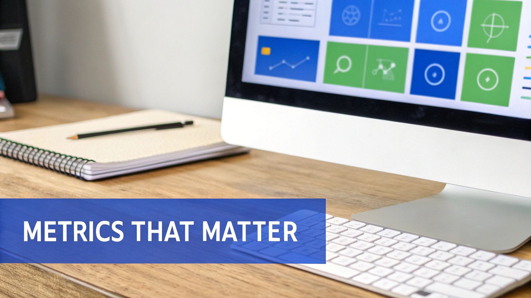
Tracking the Metrics That Actually Matter
A slick-looking dashboard is worthless if it's just showing you vanity metrics. For any Shopify brand, the real magic of a dashboard is its ability to slice through the noise and zero in on the handful of KPIs that fuel sustainable, profitable growth. It's not about just staring at numbers; it's about seeing the story those numbers tell when they're all connected.
This means getting past the surface-level stuff like daily revenue or traffic. We need to connect the dots between how you find customers, what they're worth to you, and how often they come back. When these core metrics live together in one place, you finally get the complete financial picture of your brand.
Here are the essential metrics every ecommerce dashboard should have front and center.
Key Ecommerce Metrics Your Dashboard Must Track
Your dashboard is your brand's financial command center. To make smart decisions, you need to track the right KPIs—the ones that go beyond surface-level stats to reveal the true health and profitability of your business. The table below breaks down the most critical metrics, what they actually measure, and the strategic question each one helps you answer.
| Metric | What It Measures | The Strategic Question It Answers |
|---|---|---|
| ROAS | The revenue generated for every dollar spent on advertising. | "Is my ad spend actually profitable, and which channels are pulling their weight?" |
| CAC | The total cost to acquire a single new customer (including ad spend, fees, etc.). | "How much does it truly cost me to get a new person to buy?" |
| AOV | The average dollar amount a customer spends in a single transaction. | "Are my customers buying more or less per order over time?" |
| LTV | The total revenue a customer is predicted to generate over their entire lifetime. | "What is the long-term value of a customer, and is it worth the cost to acquire them?" |
| Cohort Retention | The percentage of customers who return to make another purchase over time. | "Are we building a loyal customer base or are we a one-and-done brand?" |
| Product Profitability | The net profit of a specific product after all costs (COGS, shipping, returns). | "Which of my products are actually making me money, and which are just revenue traps?" |
These metrics aren't just numbers on a screen; they're the vital signs of your business. A well-designed dashboard doesn't just display them—it connects them, helping you see how a change in one area, like ad spend, impacts another, like long-term customer value.
Measuring Acquisition Efficiency
The first chapter of your growth story is all about how you get customers in the door. Are you spending your marketing dollars wisely? Two metrics tell this tale better than any others.
- Return on Ad Spend (ROAS): This is the clearest measure of your ad profitability. It answers a simple question: "For every dollar I put into ads, how many dollars do I get back in sales?" A great dashboard needs to show you your blended ROAS alongside channel-specific ROAS (like Meta vs. Google) to reveal what's really working.
- Customer Acquisition Cost (CAC): This is your all-in cost to land one new customer. A truly accurate CAC—something modern dashboards can automate—goes beyond just ad spend to include agency fees, creative costs, and even discounts. Knowing your CAC is non-negotiable for understanding profitability.
These two are deeply connected. A sky-high ROAS feels great, but if your CAC is creeping up alongside it, your overall profit might be shrinking. A real-time dashboard helps you balance this equation every single day.
Understanding Customer Value
Once you've got a customer, the next question is a big one: what are they actually worth? Just tracking a single sale doesn't cut it. You need metrics that show you the long-term health of your customer base.
- Average Order Value (AOV): This is the average amount a customer drops in a single purchase. Pushing your AOV up is one of the quickest ways to grow revenue without spending more on ads. Your dashboard should track AOV trends over time and by channel, pointing you toward smart upsell or bundle opportunities.
- Lifetime Value (LTV): This is the holy grail—the total revenue you can expect from a single customer over their entire relationship with you. LTV is the ultimate report card for your brand's health. But its true power is unlocked when you compare it directly to your CAC.
A healthy DTC brand aims for an LTV to CAC ratio of at least 3:1. If your dashboard shows this ratio dipping, it's a huge red flag that your business model could be in trouble. This is where predictive insights can forecast future LTV, giving you a chance to fix problems before they start.
For instance, if your 90-day LTV is climbing but your CAC is too, that's a crystal-clear signal. It's time to pour energy into your retention marketing to boost overall profitability before you even think about scaling ad spend.
Gauging Loyalty and Profitability
The final—and arguably most important—chapter is about building a business that lasts. That comes down to two things: customer loyalty and true, bottom-line profit. Not just revenue.
- Cohort Retention Rate: This metric is brilliant. It groups customers by the month they first bought from you (the "January Cohort," for example) and then tracks what percentage of them return to buy again. High retention is the mark of a brand that has nailed product-market fit and built a real community.
- Product-Level Profitability: Not all revenue is good revenue. Your dashboard has to break down profitability by individual SKU, factoring in COGS, shipping, and even return costs. This is how you find your real profit-drivers and discover which "bestsellers" are secretly bleeding you dry.
When your data analytics dashboard ties all these essential metrics together, you stop guessing and start knowing. It becomes a command center that turns numbers into your next best move, guiding you toward smarter investments, higher customer value, and truly profitable growth for your Shopify store.
Designing Dashboards That Spark Action
Knowing your metrics is one thing. Actually understanding the story they're telling you is something else entirely. A poorly designed data analytics dashboard can do more harm than good, burying killer insights under a mountain of cluttered charts and confusing numbers.
If you've ever stared at a screen packed with data but had no idea what to do next, you know the feeling. It's called analysis paralysis, a frustration every Shopify founder has felt. You have all the data in the world, but no clear path forward.
The goal isn't to cram every possible metric onto a single screen. It's to design a dashboard that guides your eye and your thinking, turning raw data into a clear narrative that sparks immediate, profitable action. A great dashboard doesn't just report what happened; it shows you why it happened and hints at what you should do next.
This is the whole idea behind story-driven data. It's a design philosophy that turns a static report into an interactive guide for your business.
From Top-Level Story to Granular Detail
The best dashboards follow a logical flow, just like a good story. You start with the big picture and then drill down into the finer details as you get more curious. This concept is called visual hierarchy, and it's the single most important principle in effective dashboard design.
Your dashboard should be set up to answer questions progressively:
- The Snapshot: At the very top, you want to see your most critical, high-level KPIs. Think blended ROAS, total profit, and your LTV:CAC ratio. This is your "how's the business doing right now?" view.
- The Breakdown: Just below that, you should see how those top-level numbers break down by key segments. This is where you compare performance across marketing channels (Meta vs. Google), customer cohorts, or product categories.
- The "Why": Finally, the dashboard needs to let you click into specific areas to find the root cause. If Meta ROAS is down, you should be able to drill into the specific campaigns or ad sets that are dragging it down.
This narrative structure means you're never lost. Your dashboard should guide you from the "what" (profit is down) to the "where" (Meta ads are the problem) and finally to the "why" (a specific campaign's creative has fatigued). This is how data turns into decisions.
Choosing the Right Visual for the Job
How you visualize data is just as important as the data itself. Pick the wrong chart, and you can easily hide a trend or, worse, draw the wrong conclusion. While there are dozens of chart types out there, most Shopify brands only need to master a few key ones.
- Line Charts for Trends Over Time: Want to see how your AOV, ROAS, or LTV has changed over the last 90 days? A line chart is your best friend. It makes trends and patterns jump off the page.
- Bar Charts for Comparisons: Need to compare CAC across different marketing channels or see which of your top five products is most profitable? A bar chart is the clearest way to show relative performance.
- Tables for Precise Details: When you just need the raw numbers—like a list of your top 20 most profitable products and their specific margins—a simple, clean table often works best.
Seriously, less is more here. A clean dashboard with three to five well-chosen, clearly labeled charts is way more powerful than a cluttered mess with twenty.
The Future is Conversational
Even the best-designed dashboards can't anticipate every single question you'll have. This is where the next generation of AI-powered analytics is completely changing the game with conversational analytics.
Imagine being able to just ask your data a question in plain English, like you'd ask a team member in Slack. Instead of digging through filters and charts, you could just type:
"What was our ROAS on the new collection launch campaign last week?"
And get a clear, concise answer instantly. This is the future that platforms like MetricMosaic are building right now. The AI acts as your personal data analyst, closing the gap between your curiosity and the insight you need. It makes deep data exploration accessible to everyone on your team, not just the data experts, turning your entire organization into a more data-informed growth engine.
Creating a Single Source of Truth for Your Data
The real power of a great data analytics dashboard is when it finally cuts through the noise. Forget flipping between a dozen different reports—it's about getting one unified, trustworthy view of your entire business. For Shopify founders, this means tearing down the walls between Shopify, Google Analytics, Meta Ads, and Klaviyo to see the complete customer journey.
Let's be honest, manually exporting CSVs, fighting with spreadsheets, and just hoping the numbers line up is more than just a waste of time; it's a huge risk. A single copy-paste error could have you scaling a losing ad campaign or killing a channel that's secretly your most profitable. This is why having a single source of truth isn't a "nice-to-have"—it's non-negotiable for any serious DTC brand.
The end goal is to trade data chaos for absolute confidence. You want to get to a place where every big decision is backed by a complete, accurate, and real-time picture of what's actually happening.
Clicks, Not Code: The Power of Automated Integration
Thankfully, the days of needing a data engineer to piece all this together are long gone. Modern analytics platforms are built for the fast-paced reality of a DTC brand, using pre-built connectors that link your most important tools with just a few clicks.
This isn't just about saving time; it's about reliability. When a platform like MetricMosaic handles the data plumbing for you, you can finally trust that your numbers are accurate and always current. This automated approach gets your whole team on the same page, ending those circular arguments over which report is "right."
A single source of truth means your ROAS from Meta Ads is calculated using the real, up-to-the-minute sales data from Shopify. No more guesswork—just a crystal-clear view of profitability.
This kind of seamless integration is becoming critical as the sheer volume of data explodes. The Big Data and Analytics Services Market was valued at $151.41 billion in 2024 and is expected to more than double to $365.42 billion by 2029. That growth is all about businesses trying to make sense of increasingly complex data streams. You can discover more insights about the big data and analytics market and its incredible pace.
Building Your Unified Dashboard
Once all your data sources are talking to each other, the last step is to design a dashboard that actually tells a story. The infographic below breaks down the three core pillars of effective dashboard design: hierarchy, chart selection, and storytelling.
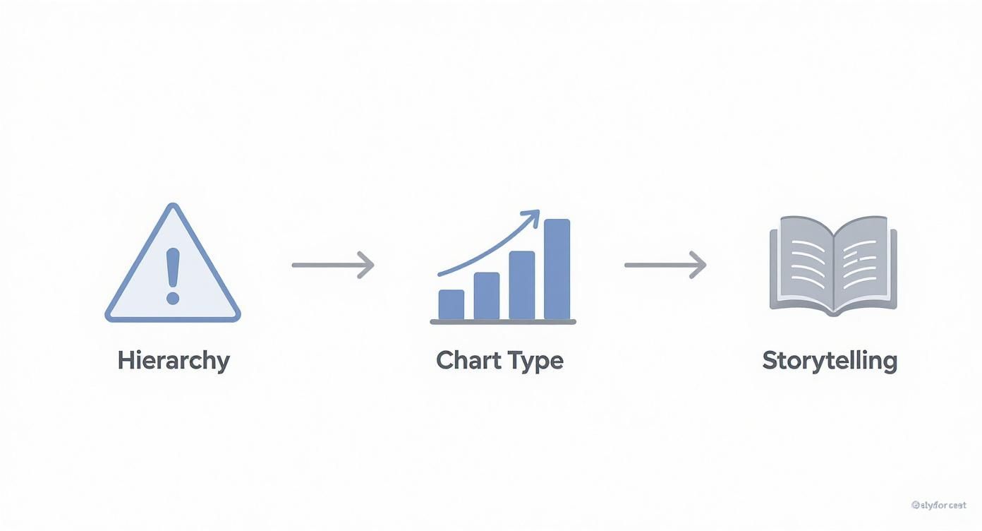
Following this process ensures your dashboard flows logically from high-level summaries down to the nitty-gritty details. It pushes you to use the right visuals for the right data, ultimately telling a compelling narrative about your brand's performance.
When you successfully unite your Shopify data with your marketing and customer platforms, you're not just building another report. You're building an intelligent, reliable growth engine for your entire operation.
How to Turn Insights into Profitable Growth
Having a great data analytics dashboard is one thing, but the real magic happens when you turn those insights into action. A modern dashboard isn't some passive report you glance at once a week. It's an active co-pilot for your brand, constantly flagging risks and pointing out opportunities to beef up your bottom line.
Think of it as the difference between seeing what happened and understanding what to do next. Instead of just spitting numbers back at you, an intelligent dashboard connects the dots and nudges you toward the next smart move for your Shopify store.
From Data Points to Action Plans
Let's walk through a real-world scenario that DTC founders know all too well. Imagine your dashboard flags that your 60-day cohort retention has dipped by 15% over the last month. Okay, that's the "what."
But an AI-powered dashboard digs deeper. It shows you that the customers dropping off are overwhelmingly the ones who bought Product X. It might even link this trend to a spike in negative reviews for that same product, all mentioning "poor quality." Now you have the "why."
That single insight immediately translates into a clear action plan:
- Investigate Product X: First, you pause the ads driving traffic to that product page. Then, you dive into recent reviews and customer service tickets to see what's going on.
- Segment and Engage: Next, you jump into Klaviyo and create a targeted email flow just for recent Product X buyers. You can offer support, ask for feedback, or provide a discount on a future purchase to win them back.
- Optimize the Experience: If the quality is truly an issue, it's time to talk to your supplier. If it's just a misunderstanding of how the product works, you can update your product page with better descriptions or a quick how-to video.
Just like that, you've turned a single data point into a strategy that saves you money and protects your brand.
Your Competitive Edge in a Crowded Market
The ability to move this fast on data is no longer a "nice-to-have"—it's becoming essential. The global data analytics market was pegged at $50.04 billion in 2024 and is projected to skyrocket to nearly $658.64 billion by 2034. That explosive growth tells you everything you need to know about how critical data-driven decisions are for staying in the game. You can read the full research about the data analytics market to see just how fast this space is moving.
Your store's data is your most powerful, unique asset. An AI-driven dashboard is the key to unlocking its value, turning what was once a complex sea of numbers into your clearest competitive advantage.
At the end of the day, a next-gen platform like MetricMosaic doesn't just show you charts. It uses predictive insights to surface these critical opportunities and risks before they blow up into major problems. It transforms your dashboard from a simple mirror reflecting the past into a crystal ball showing you the most profitable path forward.
Your data stops being a chore and starts being the engine of your growth.
Frequently Asked Questions
For a lot of Shopify founders, the whole idea of a "data analytics dashboard" sounds complicated and maybe a little intimidating. We get it. Let's break down some of the most common questions we hear and give you the straightforward answers you're looking for.
How Is an AI Dashboard Different from Google Analytics?
Think of Google Analytics (GA4) as a world-class specialist. It's an expert on one thing: what happens on your website. It can tell you everything about your traffic, clicks, and user behavior. It's incredibly powerful for that specific job.
An AI-powered dashboard, on the other hand, is like your business's general manager. It doesn't just look at web traffic; it pulls everything together. It connects your GA4 data to your Shopify sales, your ad spend on Meta and Google, and your email performance from Klaviyo. It sees the whole picture, using AI to connect the dots and tell you the full story—like how a specific ad campaign actually impacted your Lifetime Value (LTV).
In short, Google Analytics shows you clicks. An AI dashboard shows you profit.
How Long Does It Take to Set Up a Dashboard for My Shopify Store?
This is where things have gotten so much better. A few years ago, setting this up was a nightmare. It could easily take weeks of a developer's time, costing you thousands just to get started.
Today, platforms like MetricMosaic have pre-built connectors that plug directly into your Shopify store, ad accounts, and other tools with just a few clicks. Seriously. You can have a fully functioning, unified dashboard pulling in all your historical data in under an hour. All that manual, error-prone work is a thing of the past.
Can a Dashboard Really Help Me Increase My Profitability?
Absolutely. This is the whole point. A good data analytics dashboard forces you to stop chasing vanity metrics like revenue and start focusing on what actually pads your bank account: profit margin and your LTV-to-CAC ratio.
It gives you the kind of clarity that leads to smarter decisions. For example, you might discover that your best-selling product is barely profitable once you factor in its high return rate and shipping costs. Armed with that knowledge, you can actually do something about it—tweak your pricing, renegotiate with suppliers, or shift your marketing budget to promote higher-margin products instead.
These are the small, data-backed adjustments that compound over time into serious, sustainable growth. A great dashboard doesn't just show you numbers; it points you toward the exact actions that will boost your bottom line.
Ready to stop wrestling with spreadsheets and start getting clear, actionable answers from your data? MetricMosaic is the AI-powered analytics co-pilot built for ambitious DTC brands like yours. Stop guessing and start knowing.
Start your free trial today and see what you've been missing.
Article created using Outrank